Last week I showed the concept art that our art team made once we had settled on the final style for Awesomenauts. However, to get there we always go through a period of exploration, where our art team tries out various things.
Our games usually start with a gameplay concept, and once we have settled on what that is, we start looking for a world and visual style that fits this. This is a process I can personally take no credit for: our art team starts drawing cool stuff, and all I do as a programmer is give ideas and feedback. Obviously all the awesomeness comes from our art team here, and I am really honoured to work with people who draw such cool stuff! This period is a lot of fun, because they somehow always manage to surprise me with better and more interesting things than I had imagined myself. This was definitely the case for Awesomenauts, and even more so on the secret concept work that has happened more recently.
Finding a visual style is quite a complex process, since Ronimo is currently 16 people and we think it is really important to make sure everyone is involved and heard. That's difficult with such a large team, so I will talk about our process for that in a couple of weeks.
Now without further ado, here are the styles that came out of our art team's style exploration for Awesomenauts!
click for large version
Obviously, this one is pretty much a Starcraft parody. I have no idea how serious this one was to our art team, but that space-marine-cowboy is just too crazy to be true! :D
These next two focus purely on what the heroes could have looked like:
The next batch took quite a bit of inspiration from Portal's white laboratories:
click for large version
This one is actually a good excuse to talk about the gameplay at this point a bit. This is a lot earlier in development than the images I posted last week, and the game was really different then. Back than we had the idea that DotA was too hardcore, and that some people would really enjoy contributing to a DotA match, without fighting other players all the time. So in this phase the game featured really large levels with single player quests that the player could do to level help his team in combat
For example, in some of the ideas it was possible to collect mechanical parts by exploring a large platforming world. These parts could then be used to build turrets, droid factories and to craft weapons for the heroes. We never actually prototyped most of these mechanics, since we already started simplifying the game before they were actually implemented. You can see a bit of that in the image above, though: the walker in the top right could be built to patrol an area, and the turret at the centre could be manned by a player for superior fire power.
I am really happy that we threw away most of these complex mechanics: without them the game is very complex already, and it also has plenty of tactical depth as it is. These mechanics would mainly just have made the game overly complicated, very probably not more fun.
click for large version
This final one above was in a kind of biodome environment. We had lots of gameplay ideas for the dome, but I cannot remember a single one of those now. I guess the ideas weren't interesting enough to stick... ;)
Which of these styles do you like best? My personal favourite here is definitely A, but there are several more that I would have loved to have turned into an actual game. Owwww, the endless agony of throwing away cool stuff because it is impossible to make everything!
In the end, none of these styles were chosen for the game. However, the style that we ended up releasing the game with was also not chosen at this point! There was one more style here, and we went for that one: the Purple Style. In the end the Purple Style got cancelled as well and we went for what you all know from the final game. Although the Purple Style ended up really not being suitable, I still think it is one of the prettiest things ever to come out of Ronimo. Next week I will reveal this Purple Style that we worked on for months and then threw away!
Sunday, 27 May 2012
Saturday, 19 May 2012
Awesomenauts early concept art
Our art team made some great concept art for Awesomenauts, and now that the game is out, I can finally show a bit of how we envisioned it two years ago. Lots of things changed since then, so I will also give some fun notes on how we saw the game at that point. Let's start with the most noticeable change:
At Ronimo we strongly believe that for a large part, concept art should look like the actual game. So when drawing a car for a racing game, the back of that car is actually its most important part, since that is what the player will see 95% of the time. Since we make 2D games, we can take this to the extreme: some of our concept art can easily be mistaken for screenshots. In fact, for Swords & Soldiers, many reviewers actually included early concept art in their reviews, thinking it was a screenshot from the final game.
For Awesomenauts, our art team made three of these concept art shots that essentially look like fake screenshots from the final game. This helped us see what we needed for our graphics style. It is also a great way to show to publishers what the game would look like in the end.
Here are the three fake screenshots that our art team made, plus a bunch of notes on remarkable things that changed since this concept art was made:
For a quick comparison, below is a screenshot from the final game. Note especially how the camera is zoomed out a lot, and the level art does not have as much contrast as in the concept art shots. In a chaotic game like Awesomenauts, readability is key, so our art team toned down the levels quite a bit to make the characters and bullets stand out more.
I hope you enjoyed seeing a bit of how the game evolved over the years! :) For more screenshots of the final version of the game, please visit the Awesomenauts website.
At Ronimo we strongly believe that for a large part, concept art should look like the actual game. So when drawing a car for a racing game, the back of that car is actually its most important part, since that is what the player will see 95% of the time. Since we make 2D games, we can take this to the extreme: some of our concept art can easily be mistaken for screenshots. In fact, for Swords & Soldiers, many reviewers actually included early concept art in their reviews, thinking it was a screenshot from the final game.
For Awesomenauts, our art team made three of these concept art shots that essentially look like fake screenshots from the final game. This helped us see what we needed for our graphics style. It is also a great way to show to publishers what the game would look like in the end.
Here are the three fake screenshots that our art team made, plus a bunch of notes on remarkable things that changed since this concept art was made:
- As can be seen above, early versions of Froggy G looked like Samuel L. Jackson in Pulp Fiction. At some point, his afro was not deemed cool enough by our art team and was removed. After a lot of protest from other team members (including me), the afro came back. However, the game design required the camera to be zoomed out a lot more, and this required some more changes to his looks. Many of the details in his face were removed to keep the art readable on a much smaller size.
- Lots of weapons and skills changed during development. At some point, all hero's even had both a melee attack and a ranged attack. When the concept art above was drawn, Froggy G's main weapon was a lightning chainsaw. Later this changed to his famous gun-that-looks-like-a-fish.
- The big robot at the bottom right was a tower. For a long time during development, towers could move around to patrol a small part of the level. Players could also unleash them to help during an attack. However, this design was too complex and resulted in gameplay issues with backdooring (moving beyond a tower to skip part of the level), so towers later became more like a static wall.
- Originally, the shop was a vending machine with arms and legs, as can be seen above. In the final game, the healing area and the shop have been merged and the shop is not a character anymore. The vending machine concept remained, though.
- Initially we were going to make only one level, so to keep screenshots varied, we added a lot of variety to this single level: jungle, purple caves, space station elements. In the end we decided to make two more levels, allowing those two levels to be more focussed on a single unique type of environment. Since the Ribbit IV map was originally meant to be the only level, you can still see in the final game that it has more variety than the other two maps.
- As a remnant of an art style for Awesomenauts that we cancelled really early in development, the level had some purple areas, as can be seen in the concept art image above. Later our art team made these areas more brownish. If I remember correctly, this was to make the gameplay stand out better against the background. I was personally really bummed by this, because I liked the purple areas a lot. However, I guess our art team was correct about the readability and made the right choice. :)
- The object that needed to be destroyed to win the match varied a lot during development. In the end, we settled on the Solar Drill that can be seen in the final game. However, when these fake screenshots were drawn, the end goal was to destroy the big spaceship that can be seen on the left of this screenshot. A much bigger spaceship later ended up in the game as the place from which the player is launched onto the battlefield. At some earlier point, the end goal of a match was even to destroy a big multi-stage boss that you had to fight as a team! Obviously, having lots of heroes around during that boss fight created utter chaos, and thus the boss was removed.
For a quick comparison, below is a screenshot from the final game. Note especially how the camera is zoomed out a lot, and the level art does not have as much contrast as in the concept art shots. In a chaotic game like Awesomenauts, readability is key, so our art team toned down the levels quite a bit to make the characters and bullets stand out more.
I hope you enjoyed seeing a bit of how the game evolved over the years! :) For more screenshots of the final version of the game, please visit the Awesomenauts website.
Saturday, 12 May 2012
Programming with pasta
Today brings the finale to this epic series of two posts on the many connections between Italian eating habits and creating games. Whereas last week I discussed how lasagne influences game design in a good way, today I will talk about all kinds of Italian food. I will explain why programmers should not only fear the dreaded spaghetti, but also the less-known evil of lasagne. And how about pizza and ravioli? What can they learn us about the art of code?
Note that I realise that the food metaphors might be slightly lame, but the point of this post is that I think it is important to think about the implications of various structures and methods of programming, and this blogpost is basically just an analysis of some pitfalls and approaches.
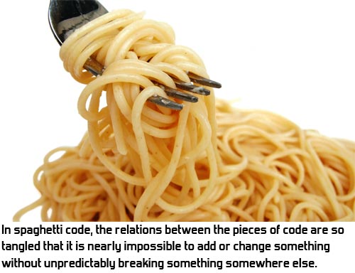
Most programmers know the term spaghetti code. It refers to a larger code base that is so intertwined, that is it impossible to know how the rest of the code reacts when you change something somewhere. Every line of code might be referencing almost any variable anywhere and maintaining the code becomes all but impossible, because the risk of introducing bugs elsewhere is too great.
The common solution to spaghetti code is also well known: object oriented programming. By using classes and making them as self-contained as possible, you can make sure that as long as the class behaves the same to the outside world, it doesn't matter if you change how it works internally. Each class is a world of its own. Of course, in practice this is more an ideal than reality, because during development classes often also need to change how they behave towards the outside world. Still, object oriented programming can help a lot to separate large code bases into smaller, more maintainable chunks.
However, there is also the other end of the spectrum. Object oriented programming can be taken too far. Let's have a look at an example from a real part of Awesomenauts. In Awesomenauts, when the player dies, the music fades out and decreases in pitch. The real situation is a bit more complex, but to keep this post readable, I'm simplifying it a bit. An intern was to implement the logic for the music. So he came up with something like this set of classes:
However, due to his internship ending, he didn't finish this set of code and I had to complete it. Problem is, that these are so many classes for such a simple task, that I almost got lost in all all the class management code and could hardly make any sense of what was working and what was not. Because the problem was so simple, I decided to just throw away his code altogether and write one simple class instead. It looks like this (again, simplified for clarity):
As you can see, this is actually really simple and understandable. No need for all these classes here. It became a little bit more complicated when shuffle and killing spree music were added, but still, the MusicManager class is short and understandable.
So what the intern did, is an example of lasagne coding: too many layers. Especially programmers who are relatively new to object oriented programming often overreact to its benefits by creating way too many classes. I belive there is something like an ideal class size. This varies per class, but I think in general classes above 500 lines are almost always too long, causing spaghetti within the class, while classes beneath 50 lines are quite often too small and thus part of lasagne. Not always of course: some classes are perfectly fine for doing one clear thing in a small number of lines.
Lasagne coding is of course a common term, but I recently discovered that few programmers are aware of this name. Most coders I meet do know that having too many classes is a bad thing, of course, but I think it helps communication and thinking to also have terms for good and bad practices.
To finish this post, I'd like to mention two more food metaphors. Pizza code and ravioli code. Unlike spaghetti code and lasagne code, these are terms I just made up on the spot because I like to talk about food. The concepts are real, though.
When programming large projects, interrelations between classes often become more and more complex. Awesomenauts has around 1,200 classes, which to me is quite a lot. Even if all of those classes are proper self-contained units, adding or changing things can still become very complex, as any number of classes might be using any number of other classes. If care is not taken, the class diagram starts to look like a pizza: a big plate of dough with all kinds of stuff randomly thrown on it and no idea what goes where or why. All the classes just happen to be there.
So to make the class diagram more manageable, I think it is better to make it resemble ravioli. Ravioli are little dough wraps with good stuff in them. They are closed off and you put the entire thing in your mouth at once and it tastes good. I'd like my code to be like that. Groups of classes work together, but can be represented to the rest of the code base as a whole. Not all of them need to even be usable outside the group at all.
The nicest example of this in Awesomenauts is the input system. This consists of some two dozen classes that together handle input from devices like WiiMotes, keyboards, mice and Xbox 360 controllers. It also handles this for five different platforms (Playstation 3, Xbox 360, Wii, PC, Mac). To the outside, however, only one of the twenty classes is accessible: the InputManager class. All other code that wants to know whether a button is pressed on some device just asks this to simple functions like InputManager::getIsMouseButtonDown(). InputManager is the dough and the two dozen classes that actually handle the hardware on all the various platforms are hidden inside the ravioli ball. If all those 1,200 classes in Awesomenauts were this clearly grouped, you would get a much more manageable 50 groups to understand the relations between, instead of 1,200 separate classes.
This concludes my food series for now. Of course, none of the concepts above are revolutionary, but I think it is really important for any programmer to think about what he thinks is good programming and what is not. In my opinion programmers who never stop coding to take some time to think about whether what they used was a good or a bad method, will never become really good. This post just outlines some of my own thoughts on the matter, and I hope they help you define Good Code (tm) for yourself.
Friday, 4 May 2012
The lasagne theory of game design
This is the first of a series of posts about lasagne. Lasagne is one of the most inspiring things that ever came out of Italy, and thinking about it is truly food for thought (sorry, I know that joke was bad). In today's post I would like to introduce to you my lasagne theory of game design, followed next week by the lasagne theory of coding.
Image from a Tesco lasagne recipe
The game design theory I would like to discuss today is probably not super original, but I think lasagne is a useful tool that can be used to analyse a game. The point here is that lasagne contains layers, just like gameplay. A game like our just released Awesomenauts at all times has various game systems active in the player's head, and during different phases of gameplay they will vary in prominence and importance. To strike the right balance and make the game fun for a long time, it really helps to recognise and analyse the layers of the lasagne.
An example will help to make this clear. Let's look at a couple of the gameplay layers in Awesomenauts:
- Combat: this is very much about quick reflexes and action.
- Short term tactics: what should I be doing right now? Attacking, defending, assassinating enemies, helping friends, collecting gold?
- Long term tactics: what is my tactic for this entire match? Am I going to stay quiet for a while to avoid deaths and slowly build a really strong hero, or am I going to attack early to be nearer to the enemy base as soon as possible?
- Exploring new possibilities: at the end of the previous match I unlocked a new class or item, let's give it a try and see what it does!
- Build experimentation: Awesomenauts has six heroes and over a hundred items. Which combinations work best?
These layers all coexist at the same time in Awesomenauts, but they can still be viewed as separate parts and it would be possible to remove or add layers. For example, if items were not free to choose, then the build experimentation layer would disappear, while all others would remain in place. We could in theory have also added a strategic layer by allowing the player to upgrade his base and directly build droids to fight for him. So although all of these layers work together to form the game, it is very well possible to analyse them separately.
Let's categorise these layers. The first question is: what makes a layer fun? This is where we see a huge difference between the combat layer and all the other layers: combat is about reflexes and fast action, while all the other layers are more about thinking and decision making. Key to making the combat layer fun is that all actions have satisfying sounds and effects. Lots of animations, particles and explosion effects make throwing dynamite a fun thing to do all by itself and even more so in combat. Making combat fun also requires that the gameplay contains counter-moves, and that it rewards good reflexes and quick decision making.
Most other layers however mainly become fun based on Sid Meier's famous quote: "A game is a series of interesting choices." For example, the tactics layers are only interesting if the decision is not always obvious. Thus the keys to fun in these layers are balance (if one choice is much better than all the others, than it is not really a choice) and variation (if the choices are too similar, then choosing doesn't matter enough).
How does the prominence of the layer vary during the player's entire game experience? This is a more subtle layer property, but an example makes it quite clear: during his very first match, the player hardly knows the items and classes in the game, so build experimentation is not relevant at all yet. However, during this phase combat is the key to the fun, because this is experienced immediately and the player can enjoy the explosions right away. Asking this question for exploring new possibilities is interesting: at the start of the game, almost everything is new, so this one is very important. Then during the first 10 hours of gameplay, the player keeps getting new items and classes to explore. But after that, he has tried them all at least once and this layer all but disappears.
The final question I am going to ask the Oracle of the Lasagne today, is: how much work does it take to create each layer? This question isn't as exciting as the other ones, but I do find it interesting that combat is the layer where a very large part of the work for the art team happens, while build experimentation requires relatively few art, but requires insane amounts of game design work to get the balance right and to add enough variation.
There are many more questions that can be asked, but this post is already a wall of text as it is. To apply the lasagne theory to your own game, try identifying what layers the game has, what properties each layer has, and what you need to do to make that layer work for the player. Hopefully splitting up your game like this will yield some interesting insights!
As is the case with most theories about game design, my lasagne theory is just an analysis tool that can be used to understand your game better. There are many other game design theories and I think the best way to work with them, is to see them as lenses that can be used to give different perspectives on the strengths and weaknesses of a game. The lasagne theory is just one lens, and I hope it can help to understand and improve your own designs.