
click for high resolution
I still consider this image to be one of the pretties things to come out of Ronimo so far. So just imagine how bad I felt about letting this one go. It was the right choice, though: this purple style is extremely difficult to read. It looks great, but in which teams are those characters? How could we visualise what skills a characters is using, when the colour palette is so limited and the backgrounds so dense?
This style finally got cancelled when, while playing around with the gameplay, it turned out that Awesomenauts was going to be very chaotic. This chaos was part of the fun, but a chaotic game requires a lot of clarity in the art, which is just not possible in the Purple Style. So we switched to something that was inspired by the likes of Earthworm Jim and Ratchet & Clank.
Since we worked on the Purple Style for several months, lots of cool concept art was made for it. Our ideas for the setting were not very clear, but some keywords were "Shangri La" and "eastern".


When we started working on Awesomenauts, we were quite unhappy with Flash and wanted something else. Flash was too difficult to handle for anything but flat shading, and we wanted more details and gradients in our artwork this time. So the idea at first was to create 3D models and render those to textures. This turned out to be too much work, though, so when our former intern Marlies Barends showed us After Effects and how excellent it is for animating detailed 2D art, we switched to that for all our character animation.
However, in the meanwhile I had already been playing around a bit with how to get those 3D models to look good for a 2D game. A couple of years before that I had made a 3D model of Captain August (a webcomic by Roderick Leeuwenhart), so I added some basic animation to that and created a couple of cartoon materials in 3D Studio MAX to see whether that would work. It doesn't look as 2D as I wanted, but it does look quite interesting, I think:
I also tried dropping that guy in the 2D environment art that we had:
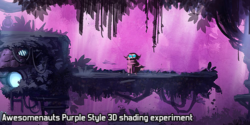
Of course, we didn't just work on the characters, but also on the environments. Since this would play in a forest, our art team wanted to add variation by using the entire height of the forest. So the top of the level would play on top of the trees, showing mountains in the distance, while the bottom of the level would play on the ground, between roots and small streams.


Finally, while looking through our concept art archive, I came across this one, which I had never even seen before! I really like the flowing lines here, so I'll end this post with this great piece of linework:

Next week, I'll explain what process we use at Ronimo to involve all 16 developers in choosing a visual style for our games. It is difficult to involve so many without grinding to a halt in endless discussions and brainstorms with way too many people, but I think by now we have found a pretty good process for this!
The style looks really nice. It doesn't fit the Awesomenauts gameplay, but it would be excellent for a single player platformer. Is that a type of game that Ronimo would make?
ReplyDeleteYour reasons for dropping the purple style are similar to Blizzard's response to the Diablo III art style thing. People photoshopped screenshots from the game to make them darker and moodier, and the D3's art team agreed that they looked better, but said that it just wouldn't work for gameplay. You really need the contrast between the game level and the characters/monsters/destructibles for the game to be playable.
ReplyDeletelooks alot better than awesomenauts:D
ReplyDeleteMay I steal this art style for my next project? I love it. I'll probly show these images to my artist when the time comes to do something simular.
ReplyDeleteStealing art styles is of course never okay (since we made these, we automatically have copyright on these images), but getting inspiration and then giving it your own twist is totally fine. :)
DeleteYou guys should make a stage with this theme! It would be a nice throwback for you guys, as well as looking awesome because, I think EVERYONE can agree that these can look great!
ReplyDeleteI am a big fan of Ronimo Games since S&S. With that game you really fed my hunger on humorous medieval concept. You see, i am a fan of medieval times too. Awesomenauts is great too but Sci-Fi is not just my thing. I really hope that your next game will be like the art concepts above, far-east themed action game. But this time i want you to come up with not fun but serious. I want to hear a great story from Ronimo. Actually ,i just hope. You will do whatever you do best i believe.
ReplyDeleteLooks nice, but I'm glad they went for sci-fi cartoon-style instead. All other MOBA-games are fantasy-themed anyways, so I feel like Awesomeanuts has more of its own identity the way things are now
ReplyDeletesince you've done the kick starter now you started to expaned the game. maybe you could do more different things like this. like on a different planet you could encounter new nauts that looke something like this
ReplyDeleteWell this is just amazing, i just love how all the characters look, the art style is pretty cool, same with the map, i wonder if someone can take any of those characters and make at least skins for the current awesomenauts characters, that would be a great idea!, release the skins and the map as a DLC !
ReplyDelete