Showing posts with label lighting. Show all posts

Saturday, 2 May 2015

Making gameplay stand out against rich backgrounds

Good game graphics are not just about being pretty. Equally important is that they communicate well. The richer and more detailed a visual style becomes, the more difficult it is to communicate gameplay clearly. With the amount of detail and variation we wanted in Swords & Soldiers II it was a challenge to make the units, spells and other gameplay objects pop out against the colourful backgrounds. Today I would like to show the tricks our artists used to make this work.

The reason this is important is that otherwise it would not be clear which objects are interactive and which are not. For example, is a tree a wall that I cannot pass through, or just a backdrop that has no effect on the gameplay? Ideally these kinds of things are immediately and intuitively clear to the player, without requiring any explanation.

Our new game Swords & Soldiers II launches on Wii U on May 21st.

The easiest way to achieve visual clarity is to not have any backgrounds or effects. Just a flat-coloured background with the gameplay objects. This looks horrible of course, so we want to add more art to the game. In general, the more you add to the world, the more difficult it becomes to distinguish gameplay objects from graphical fluff. In truly rich visual styles achieving clarity is a challenging balancing act. Objects should look like they belong in the world but at the same time pop out. The creators of a game can even choose to let go of visual clarity if they value visual beauty more.

At Ronimo gameplay always come first, especially when creating highly tactical games like Swords & Soldiers II and Awesomenauts. This means our artists had to employ a lot of clever tricks to combine the lush visual style with gameplay readability.

Our art director Gijs Hermans is responsible for maintaining a consistent style throughout the game. For this blogpost I interviewed Gijs about the tricks used in Swords & Soldiers II. Our level artist Ralph Rademakers showed me some additional tricks. Below I will be showing the clever techniques they used to make the gameplay stand out.


To make characters, spells and towers stand out against background objects they are drawn in a different style: with outlines and cell shading. The backgrounds are more painterly, lacking outlines and with more brushy and subtle lighting.


In many Disney classics, like Jungle Book (top), animated objects are in a different style than non-animated objects. Our artists love this combination so they even combined the animated and non-animated styles within the Viking base for its different parts. Note the difference in outlines and shading between the animated caterpillar and the ship itself.

(Click for high resolution)
The first version of the Viking base was more in the style of the backgrounds. To make it stand out more the final design was pulled more towards the gameplay style.


Early in development characters had hardly any shading (top), making their shapes less readable. Their final designs (bottom) have deeper shading and more saturated colours.

(Click for high resolution)
Our artists tried a lot of different shading and outline styles for gameplay objects. This image shows a series of early experiments with the goldmine. All the way to the right is the final design. Be sure to click this image for full resolution, since this scale does not show the differences well.


Background graphics are less saturated. Our level artist Ralph even used such atmospheric perspective on objects very close: the house here is directly behind the playground and thus too close for 'real' atmospheric perspective. Ralph desaturated it anyway to make gameplay stand out more.


Sheep are sometimes gameplay objects and sometimes background objects. To make this clearer they are blended a bit towards a single colour when they are in the background or foreground.


Background brightness is often changed to make gameplay stand out more. In both of these images the background is brighter near the gameplay layer, adding contrast. Higher up in the screen no gameplay happens, so there 'normal' colours are used in the background.


Gradients are not the only way to make the playground stand out: here the bushes directly behind the playground don't have snow, turning them into a green border between the snowy playground and the snowy trees. It would be weird if only these objects lacked snow, so snow is also removed from other objects like the rooftop in the background on the left.


Corpses have gameplay functionality but having lots of them really clutters the view. We therefore desaturate corpses to make soldiers walking in front of them stand out more.


Depth of field blur on the background not only adds depth but also makes the foreground pop. We use this trick in both Swords & Soldiers II and Awesomenauts to make gameplay more readable.

Saturday, 8 November 2014

Using 2D daylight assets to create a night level

Changing the lighting in hand-drawn art is a challenge. While in 3D games you can simply modify the light, there is no such thing when using 2D assets. In our new game Swords & Soldiers II all the level assets have their lighting drawn in. Of course you can ask the artist the redraw the image with different lighting, but that costs a lot of additional time and texture memory. We managed to re-use our daylight textures to create convincing nighttime levels, so today I would like to explain the tricks used to achieve that goal.

Today's post is all about the artistry of Ronimo artist Ralph Rademakers. He uses images drawn by Adam Daroszewski* and Gijs Hermans to decorate the levels in Swords & Soldiers II. Ralph keeps surprising me with the unexpected tricks he manages to pull off with our internal tools.

*By the way, note that Adam works as a freelancer these days. He drew most of the level props in this post and you can see some more of his amazing work here.

There is basically a whole series of tricks that Ralph uses to turn day into night. I'll let the images do most of the talking today:


Even in the night a form of atmospheric perspective can be used: in the video below the smoke in the foreground is much brighter than the smoke in the background to suggest additional depth. When I built the recolouring shaders and tools I never expected them to be used on almost every object in the levels. Also, note how the stars have been made using particles to make them blink and appear in random places for a more lively look.


As a starting point Ralph usually chooses one colour multiplier for all objects in the level. He tweaks the colour per object to make it look exactly right. In the end few objects use the same colour multiplier, but they all started from the same point.


It surprises me how often these gradients are reused. From fog to lights to lens-flares and even just for hiding objects that should not be visible from certain viewpoints. The big downside of this approach is that it results in a lot of overdraw, which is also the main performance bottleneck in Awesomenauts. Good thing modern videocards are so insanely fast...


The lights in the bar below blink to make the scene more dynamic. However, blinking lights attract the eye too much while the focus should be on the gameplay. Therefore the blinking is not between on and off, but between the more subtle slightly-bright and extra-bright. Also note how the blinking lights illuminate the barmaid's arm.


This bar is also a great example of Ralph adding tons of little animating details, like the drunk guy on the roof. Many of those details will likely not be seen by most players, but the total effect of having such a detailed world is very strong, even for players who don't look at it specifically.


As a programmer when thinking about lighting in 2D games I immediately start considering technical solutions. I would look at things like normal maps (very possible in 2D) or automatic rim lighting. However, more creative, art-driven solutions often work much better, especially when creating a visual style with such a painterly look as in Swords & Soldiers II. The simple yet clever techniques Ralph used to create this nighttime level are a great example of this.

Saturday, 27 November 2010

Coloured light in Proun

(At Ronimo Games, the Dutch game developer where I am lead programmer, we are currently looking for a coder with experience on the 360 and/or PS3. Interested? Have a look here for more information!)

Last weak I talked a bit about the technical side of lighting in Proun. This week, let's have a look at the more artistic side: the strange light colours I chose for each level.

A very common lighting setup among 3D artists is to let the sky emit a soft blue light, and the sun a bright yellow. This of course makes sense, since these are the colours that the sun and the sky have in the real world.

The fun of having these different colours for the skylight and the sun, is that the sun's shadows become a subtle blue. Brightly lit spots, on the other hand, may become slightly yellow. This fits what my highschool art teacher used to tell me: never paint a shadow with black, always add colour. (Of course, I didn't really understand her at the time...) Since I like this setup, I used it for Proun's first track.


For the second track, I wanted to use a totally different colour palette. Now I am not very knowledgeable in colour theory, but I did notice that yellow and blue are exactly opposite colours. So again I chose opposite colours and after a lot of experimenting with the colour scheme that I had in mind, I came up with a cyan/blue sun and an orange skylight. That is one really weird lighting setup, but I do think it looks good:


The third track is probably the weirdest. A greenish/blueish sun is combined with a pinkish skylight. I think this mainly proves that as long as two colours are chosen that work well together, the colours can be as crazy as you like. So no need to go for the standard lighting setups any more!


So, as these images show, the bright colours of Proun's objects are combined with much more subtle colour effects from the lights. Having just the bright colours worked perfectly well for many works by Kandinsky and Mondriaan, but I think in Proun's case, the subtle colours and shades that the lights add are what really make the graphics shine.

Saturday, 20 November 2010

Lighting in Proun

Proun is getting a lot of very positive responses to how it looks. Most people seem to think that the depth of field blur is the core reason for this, but the game still looks pretty good when that is turned off. What really makes the biggest difference, is the careful lighting.

Since most of Proun's environments are static, the lighting is calculated beforehand and stored in lightmaps. Calculating lighting beforehand is called baking. Baking should not be confused with cooking, which stands for saving memory directly to disc (this is used to speed-up loading times, because you don't have to parse cooked data). Interestingly, I have heard rumours that the terms baking and cooking are also sometimes used for certain algorithms that are used in kitchens, but I don't know anything about that.

Lightmaps take up a lot of space (one third of Proun's total size), but they have some big benefits. Because lighting is calculated beforehand on the developer's computer, it doesn't matter if it takes a lot of time. This means that much more complex lighting can be used than when it is calculated in real-time. In Proun, I use this a lot. I think calculating all the lightmaps for just the second track cost my laptop about 30 hours!


The further a shadow is from the object that casts it, the blurrier is gets, especially if the light source is large. Lights that cast shadows that get blurrier with distance are usually called area lights. In practice, it is hardly ever possible to calculate this in real-time, so most games have either fully sharp shadows (as if the light source is infinitely small), or a fixed blur that ignores distance.


(On a sidenote: as soon as Proun is finished, I am going to implement a technique that I have come up with that makes it possible to render real-time area light shadows in games with a Diablo-like perspective.)

In the real world, a lot of light does not come directly from the sun: part of the light is scattered by the atmosphere and comes from all directions. Such light from all directions is called skylight. Skylight makes shadows less deep and add a lot of subtle shadow effects to the world.


Objects reflect light. So if light falls on a red object, then this object will reflect a little bit of red light onto the objects around it. This is called global illumination. This is a very subtle effect, but because of Proun's bright colours it is clearly visible in a couple of places.


All of these things are only possible because in Proun, lights don't move and almost all objects are static. I could not have used lightmaps otherwise. The levels are also small enough to store high quality lightmaps of all objects.

The things I discussed here today are pretty technical. In a future blogpost I will talk a bit about the artistic side of Proun's lighting: crazy light colours.

Saturday, 13 November 2010

Sun rays


Writing shaders is one of the things that I enjoy most in making games. Kind of surprising, really, because generally I dislike doing low-level coding and optimisation. Shaders are among the worst in terms of dirty hacks and hardware specific code. So why do I enjoy writing them, then? I think shaders attract me because of this: they are so limited, that science and optics become totally useless. The way real light works is so much more complex than what you can do in a shader, that you need to just make something up that kind of looks similar, although it is often totally unrealistic. Physically, most shaders are utter nonsense. So instead of being all about knowledge and math, shaders centre on creativity and experimenting. Now that's fun! (At least, to a special kind of people, also known as Joosts.)

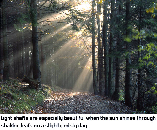
One of the nicest examples of creativity in shaders is how light shafts are rendered in games. Light shafts are also known as god rays, volume light, sun rays or Jacob's ladders. They are what you see when a light shines through misty air. The microscopic particles in the air are lit and become visible.


Rendering volume light realistically takes a lot of computation time. You need to trace rays through air, take into account the density of the mist, and for a large number of points in the air you need to calculate whether the particles there are illuminated by your light. This includes doing shadow calculations for each of these points in the air. This is way too complex to do well in real-time.

So, some clever programmer somewhere (not me) came up with a trick that looks great and is a whole lot simpler to do. The idea is really simple: you just walk over the image from the pixel towards the sun, and look how much light there is in the image.


Click here for the original article about this technique, which is also the source of these images.

Things like volume, fog density and shadow are completely ignored. There is hardly any relation between this technique and how real volume light works, but somehow it looks very similar and really convincing. Games like Far Cry 2 and Crysis use it to create beautiful lighting effects through the leaves.

There are some limitations to this technique, though. Most importantly, it only works if the light source itself is actually in view. For example, using this technique, it is impossible to render the effect of a flashlight that is pointing away from the viewer.

Rendering light shafts this way not only looks awesome; it is also one of the most beautiful, simple and ingenious shader techniques I know of. Since I like this effect so much, I couldn't help myself but add it to Proun's third track. The track's graphics are far from final, but the light shafts are there. The little video at the beginning of this post shows how dynamic the effect looks in motion.

Saturday, 18 September 2010

Overbright colours, blur and faking it

Last week I talked about depth of field blur, a very obvious and visible graphical effect in Proun. Now let's look at one that is a lot more subtle: blurred HDRI.

In computer games, colours are usually stored with values from 0 to 255, with 0 being black and 255 being white. Few people realise that this introduces some limitations.

The problem is that when an object is lit by a very bright light, its colour might actually have brightness 400 instead of 255. To solve this, graphics cards usually just round this down to 255, since your monitor or television cannot show anything brighter than that anyway.

But what happens when we blur such a bright area with its dark surroundings? Without blur, a white square with value 255 looks the same as one with value 400, because monitors cannot show anything brighter than 255. However, when blurred, there is a big difference, as you can see in this image:


As you can see here, when blurred, really bright objects should look like they grow: they overshine the area around them. Dark details around overbright objects can even totally disappear this way. In Proun, this can be seen clearly in the white boxes at the start of the first track: in the distance, their black outlines disappear. I love to look at this effect:


Allowing colours to go beyond 255 is called HDRI (High Dynamic Range Lighting). On the graphics hardware, to make this happen, you can simply turn this on. (In technical terms: switch the render buffer from 8 bit fixed point per colour channel to 16 bit floating point).

However, that is pretty slow, especially on slightly older videocards. So to save a lot of performance in Proun, I faked the HDRI in a pretty easy way. Objects are simply rendered half as bright as they really are and then after the depth of field blur has been applied, the pixels are made twice as bright again. The end result looks just like HDRI, but without the slowness.

There are two drawbacks to this, though: values cannot go above 511, so there is still some rounding down of the colours going on, and when made more extreme (as is done in the tunnels in Proun), artefacts become visible because everything is made so much brighter. Those artefacts are rarely visible in Proun, but they are in this specific tunnel (still quite subtle, so this may be difficult to see on some monitors):


An extra benefit of doing HDRI, is that bright colours combine into new colours when blurred. This is kind of a weird side effect, but it looks really cool in the places where the spheres overlap in this image:


Which reminds me: I need to do something with explicitly coloured glow in a future game. Maybe have a bright brown object with a green glow or something like that. :)

Sunday, 5 September 2010

Failed/fixed leashing in Proun

Any level designer knows the word leashing: to lure the player into the right direction using things like light, colour and bright shiny power-ups. If you put the player in a large, open forest, you can still be almost certain where the player will go by making the entire forest slightly dark and lighting one patch really brightly. The player feels like he has the freedom to go where he wants, but he is on a psychological leash and the level designer gets to pull it. Come here, doggy, fetch the stick!

In track 2 in Proun, at the end of the lap there is a tunnel. There are obstacles in this tunnel and the player needs to avoid them, like this big yellow circle thingie:


Oddly, during playtests, I saw that about one in four players would rotate towards the obstacles, instead of avoiding them. Really strange, because in every other part of that track they immediately understood where they needed to go.

Then one of my testing victims (Marlies Barends, accidentally also the creator of this awesome animation) explained to me what was going wrong: the obstacle that you need to avoid has a bright colour, while the tunnel is a dull grey. Also known as: bad leashing!

The solution is simple: I put the light behind the obstacle instead of in front of it. Now the obstacle is in shadow and the tunnel behind it is brightly lit:


I haven't tested this on real dogs yet, but I expect them to know where to fetch the stick now! :)