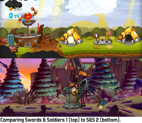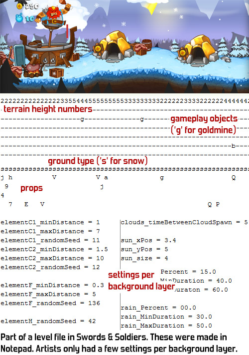
In the original Swords & Soldiers the levels were mostly procedurally generated. The only parts that were placed by hand were the ground itself and the small props on it, like grass and flowers. The foreground and background layers were randomly filled with objects. Since this is essentially a 1D game I simply wrote an algorithm that placed mountains (or trees, or houses) at varying distances from each other. Each layer had a bunch of different textures and settings for how densely it should be filled with objects.

There are many arguments in favour of procedurally placing objects like that, but at the time only one really mattered: we didn't have any tools to place objects by hand. I was the only full-time programmer on Swords & Soldiers 1 and I had to build all the gameplay plus the entire engine, so there was no time to create such tools. I did have a couple of interns helping with programming, but in total there was just way too little time to implement any real tools for level creation.
Levels therefore had to be created in Notepad, as I previously described in this blogpost. This worked surprisingly fast and simple for our artists and designers, but of course precise control over graphics is not possible this way.

Our artists had a limited palette of options to differentiate levels and create varied places. They made six different art sets they could use for parts of levels: desert, snow, grass, rocks, jungle and cherry blossom. They could set a gradient for the sky colour and a second gradient to modify the colour of background props. They could set the weather to rain or snow, modify the density of background props, foreground props and clouds and place smaller props on the landscape by hand.
While all of these options together may sound like a decent set of tools to create unique levels, in practice this is not the case. Levels in Swords & Soldiers 1 quickly blend together and start to look similar. One reason for this is that levels often contain more than one environment type. They might for example vary between rocks and desert. An environment type always randomly varies between all the textures it has. The result is that in only a few levels we can have seen nearly all level art in the game. In fact, the very long Berserker Run level contains all six settings and thus contains nearly all level art the game has.

Another problem is that randomly placed objects may stand in a different spot in every level, but they all feel the same. No matter at what distance the same set of mountains is positioned, it always feels like the same place. This could of course be done better with a more advanced procedural algorithm and a smarter set of textures, but in practice procedural content nearly always suffers from this.
This problem even shows in a game like Diablo III, which has high quality procedural world generation at its core. Blizzard spent enormous amounts of time on creating sophisticated algorithms and tons of art assets for random world generation, and yet when I played through Diablo III it felt like I was constantly visiting the same places. Either a place is uninteresting, with some random trees and bushes, or it is unique with some special big props. The number of unique props in Diablo III is large but not infinite, so they start to feel repetitive quickly.
I have not seen a single game with procedural worlds where the visuals did not become repetitive really quickly. In that sense I am slightly afraid for No Man's Sky: the game looks mindblowingly amazing, but I can hardly imagine they solved this problem well enough to keep planet discovery visually interesting. (I sure hope they did though, because that game looks soooooo good!)
In Swords & Soldiers 2 we therefore concluded that we did not want to use this approach anymore. We also don't need to work around a lack of tools anymore, since we now have the impressive toolset we created for Awesomenauts. All of that is at our disposal for Swords & Soldiers 2 as well.
By placing most objects by hand our artists can now create real compositions. The way trees are arranged can create forests, small clearings and green fields. This way even without additional assets it is possible to create places that feel much more real and unique than any procedural algorithm can. Of course one could add procedural rules to create such places, but there are limits to how much can be done this way, especially because every rule that creates a specific kind of place can be used only a couple of items if repetitiveness is to be avoided. With a good artist there really are no limits to how much variation and uniqueness can be created. Most of the levels in Swords & Soldiers 2 are filled with art by Ronimo artist Ralph and he is a true master at creating interesting compositions and little micro-stories through object placement.

Another big difference between Swords & Soldiers 1 and 2 is that in 2 we have much bigger props. In the original game mountains and trees were relatively small, so you always saw a lot of them. In the sequel we have scaled them much larger, so you might see only one or two really large mountains in the background, instead of dozens. This makes it all feel a lot larger, drawing the player more into the world instead of looking at funny miniatures. At the same time this makes the backgrounds look less repetitive: if you don't see ten mountains at the same time, then it is also much less obvious that several of them use the same texture.
This is strengthened by another big improvement in Swords & Soldiers 2: there are many more unique assets for specific levels. For example, one level plays in a Viking golf court and there are golf related objects everywhere. These props are not used in any of the other levels, making this level unique and memorable. This way the player will remember more specific things than in Swords & Soldiers 1, where all the levels looked quite similar. A level doesn't even need all that many unique props: since background objects are so much larger now, having one really big prop can sometimes already define a level.

Another improvement that I would like to mention today is the art style. The original game had a very simple cartoony look, while the sequel is much more detailed and painterly. Our artists went for a style reminiscent of French animation and it works beautifully. Most of the level art in Swords & Soldiers 2 is drawn by Adam Daroszewski. He worked as a freelancer for us and did an amazing job at creating a painterly and coherent look.
I have spent most of this blogpost explaining how Swords & Soldiers 2's level art is better than the original. There is however also one big downside: it is much more work to make. With the lack of proper tools and the simple style we had when we made Swords & Soldiers 1 it took very little time to decorate more levels. In part 2 everything requires much more work to do. It really shows, but it is an important trade-off to be aware of. Not having proper tools means that there are a lot of things that artists simply cannot do and this saves huge amounts of time.
Limitations like that are a very effective way of limiting the amount of time it takes to make a game. The better your tools, the bigger the risk of using them too much. We have already spent much more time making Swords & Soldiers 2 than originally planned and the game isn't even done yet. At the same time it is looking so good that spending so much time is totally worth it. I hope that when the game launches you will be as enthusiastic about it as we are! ^_^
In conclusion, I would like to say that I think procedural level generation is great for games that evolve around it, but for a designed experience having hand-made levels works much better. Levels in a game like Swords & Soldiers 2 look better when made by hand than when generated.
Very nice post again! Did see a small typo I think "With the lack of proper tools and the simple style we had when we made Swords & Soldiers 2 it took very little time to decorate more levels." This should be S&S1?
ReplyDeleteThanks for noticing, fixed! :)
Delete