Wednesday, 31 March 2021

I’m leaving Ronimo, here’s why and what’s next

After 14 years at Ronimo, I’m leaving the company I co-founded. I’l keep making games, but starting this months it’s on my own (and in the future maybe I’ll start a new studio). This news makes me both very sad and very enthusiastic. Sad that I won’t be working with my amazing friends at Ronimo anymore; enthusiastic that I will have total creative freedom to make exactly what I want to make. Today I’d like to share why I’m leaving, and what I’ll be doing next.

The reason I’m leaving is that I want the creative freedom to carry out my own ideas. I have tons of concepts for games, music and art, but I can’t execute them at Ronimo. I might have had a leading role at Ronimo as technical director, producer and co-owner, but when it comes to creative choices, Ronimo is a pretty democratic company: everyone has input on creative choices. That’s great for the creative process: tons of ideas bubble up and stuff that a lot of people are enthusiastic about makes it into the games. However, with 7 founders and a dozen employees that means that my actual creative say wasn’t that large. Especially since Ronimo makes only one game every 3 years.

That used to be fine for me since I had a creative outlet in my spare time. I made Proun, Cello Fortress and The Ageless Gate that way over the years. However, three years ago I became a dad and this has reduced my spare time a lot.


I solo developed Proun and Cello Fortress in my spare time, including code, design, music and 3D art.

The trigger for me to decide to leave Ronimo was a conversation with my wife, Marissa Delbressine. I always write down my ideas in my notebook. However, this became pretty depressing when I realised that I didn’t expect to be able to do anything with all those notes. So I said to Marissa: “I might as well not write down my ideas anymore, since it feels so useless if I can’t do anything with them.” This made her very sad, more than I had expected. Marissa is a creative person herself (she’s a comic artist, currently publishing The Shadow Prophet on Webtoon) so she could imagine the pain of telling yourself not to be creative anymore.

Marissa’s response got me thinking: maybe instead of dropping my own ideas, I should quit Ronimo instead. But I also didn’t want to abandon my friends. So in Autumn 2019 I told the other founders of Ronimo that I wanted to leave, but that I wanted to first finish Blightbound with them. They were sad to see me leave and tried to convince me to stay, but they also supported me in wanting to follow my own path. Their response was heart-warming to me. After all these years the co-founders are still my friends, but I will see them a lot less now. I will miss them dearly, as well as the rest of my former colleagues at Ronimo.


The 7 founders of Ronimo back in 2007, a few months after we founded the company. I'm on the left, lacking both a beard and grey hair back then.

Since people often leave their company because of frustrations or disagreements I would like to stress that that’s not the case here. I just want full creative freedom to explore my ideas, and that’s the only reason for my departure. I still love the folks at Ronimo and I plan to keep hanging out with them regularly (well, once the current pandemic dies down, I guess).

When I first talked about this with the other founders, we still thought I would be able to leave Ronimo in Summer 2020. But Blightbound got delayed and I decided to finish the game with the team. Then the game got delayed some more, and we agreed to set a final date, since I got restless as my departure kept moving. That date is now. As of this month I don’t actively work for Ronimo and I don’t have any management responsibilities anymore.


Blightbound, which is currently in Early Access on Steam.

So, what will I be doing next? I mentioned I had tons of ideas, so I won’t be spending any time brainstorming or soul-searching. Instead, I’ve started already. My plan is to spend the next year learning new tech and skills and doing a bunch of smaller projects. After that I want to start making a bigger game that will hopefully be the start of a new studio.

I’ve already taken the first step last week: I’ve finally released my album The Ageless Gate. I’ve been working on this album for years and it’s great to finally get it out there. It’s available on all the streaming services, with links to all of them here. The Ageless Gate is an instrumental concept album with lots of cello and a narrator that tells an overarching story in short fragments at the starts of the songs. It’s quite a unique thing and I hope it will find an audience!


Here's a preview of Sandrider, an intense cello trio and the opening song of The Ageless Gate.

As for the coming year, for now these are the smaller projects I intend to do:

  • Finish the Steam version of Cello Fortress. This should become playable with any musical instrument (instead of just cello) and won’t require an audience to play against anymore.
  • I’ll apply for a government grant to experiment with my procedural music system and to turn that into a streaming radio station.
  • Make a minimalist railroad building game.
  • Make a crowd physics puzzle game with ballet and monsters, inspired by the art of the Dufy brothers.

I also intend to learn a lot of new stuff. The main big things will be switching to Unreal Engine and Blender and learning the ins and outs of both. I also plan to expand my knowledge of UI design, design of management games and economies, task-based multithreaded programming and data-oriented code.

Then later on I hope to start working on a bigger 3D management/building game. I have a bunch of concepts for such games lying around and I currently tend towards one of the sci-fi ideas. I hope to build a bigger studio around this, focussing on high-quality 3D management games, similar in production value to games like Frostpunk, Planet Coaster and Two Point Hospital. I hope I’ll be ready to start pitching to investors with that in a few years.

It will undoubtedly take quite a while before all of these plans start making me a decent income. However, I’ve always been rather frugal, so I’ve collected enough savings that I can survive on those for long enough.

One thing you can see here is that I plan to do a LOT. Way too much, probably. I think this is going to be my biggest challenge from now on: keeping the scope of my projects small and limiting my expectations of how much I can do in a week. For years I’ve bottled up so many ideas and plans that I want too much too fast now. I’ve noticed that I’m already experiencing some stress because of how much I want to do, so keeping my plans realistic and doable in a chill manner is going to be my biggest challenge.

A clear split between work and leisure is going to be paramount to that, since up until now my hobby projects were my leisure. Now that they’ve become my work, I should make sure to not become a gamedev monomaniac. I’m sure my wife and son will help keep me grounded though, so I expect this will turn out fine.

I would like to conclude by thanking all my friends at Ronimo for 14 years of great fun. Thanks for everything I’ve learned from you and thanks for sharing all the lows and highs of making games together. I’m sure I will miss the banter and the laughter at the office most!


On my last day at Ronimo, the art team chose me as the theme for their biweekly sketching session. I love the resulting portraits! Art by, from top to bottom: Gijs Witkamp, Koen Gabriels, Ella Kremer and Gijs Hermans.

Sunday, 28 March 2021

The Ageless Gate is OUT NOW!

On Friday I released my album The Ageless Gate! It's my atmospheric debut album with instrumental music and lots of cello. Together, the 13 songs tell a tale that spans three centuries, starting with a mysterious artefact and culminating in a gate to another world. The story is told by short text pieces in between the songs, voiced by voice actor Chris Einspahr.

The album is available on all the major streaming services (Spotify, Apple, Amazon, Tidal, Deezer, etc.). I've also made a deluxe CD edition in a limited pressing. Links to the different places where you can listen to the album can be found here:

Click here to listen to The Ageless Gate


For the cover of the album I combined a cello bridge with a sci-fi portal, bringing together the musical core (cello) and the storytelling theme of the album.

My cello is the foundation of the album, which varies from cello trios to songs with cello, drums, guitar and keyboard. The sound goes from melodic and euphoric to dark, pumping cello rhythms. Cello is mostly known as a classical instrument and a background instrument, but it’s so much more than that. For this album I really enjoyed experimenting and exploring the possibilities of the instrument. My favourite examples of that are the fast arpeggios in the opening track Sandrider, and the gliding chaos tones in Approach of the Derelict Research Station.


Here's a preview of Sandrider, an intense cello trio and the opening song of The Ageless Gate. The image shows the CD edition of the album, which can be ordered here.

I've worked on my album for 3.5 years and it's great to finally have a complete thing, with the storyteller, the art, the music and the production all working together to create one coherent whole. It started out as just a bunch of songs, but as I wrote more of them I realised they could be telling an overarching story. From that point on I started writing that story and also changing some of the compositions to make them work in the bigger whole. For example, A Century Flies By and A Century Sails By started out as one song, and I split them into two short related pieces since I liked them as bookends in between the chapters, marking the passage of time.


The story plays out in different time periods, as is seen on the back of the CD edition of The Ageless Gate.

While working on the album I learned a lot about composition, recording and music production. One of the biggest lessons I learned is that it's pretty doable to record a bunch of cello takes and then cut them in pieces to combine the best bits. This helps me a lot in achieving a consistent high quality cello recording. Before I knew this I thought I needed to record an entire song without any mistakes and this made me super nervous during recordings. Now I know that recordings with mistakes are useable, as long as the mistakes aren't always in the same spot.

My other big lesson is that mixing/mastering is such a specialised field that I should again hire a professional for that. I first tried doing it myself, but even after spending considerable time with tutorials and experimentation, I couldn't get it to sound pro. In the end I hired Daan Kandelaars (Tremor.Studio), a professional mixing/mastering specialist, and his versions sound so much better than my own did. For my next album I won't first try to make final mixes myself and will instead hire a pro for mixing and mastering right away.

All in all I'm super happy with the final result and I hope others will like The Ageless Gate too! I'd love to hear if you have any favourite moments on the album!

Wednesday, 17 March 2021

Super flexible 2D animations through the Blightbound Skin Editor

Last week I discussed how we used After Effects and Duik as our animation tools for Blightbound, achieving crisp animations at high framerates with small filesizes and nice tools for our animators. The real strength of this workflow however comes from our Skin Editor. This makes it possible to reuse animations, quickly tweak the looks of characters, swap gear, add special effects and attach objects to characters convincingly. Today I’d like to explain the ideas behind our Skin Editor and how this impacted the work of our artists.

As I showed in last week’s blogpost, the basic idea behind animations in Blightbound is that a character is made up of parts (hands, torso, face, upper arms, lower arms, etc.). These parts move and rotate and the game plays that back directly, instead of using sprite sheets.


Characters in Blightbound are animated using parts, and frame-to-frame variations on those parts. This shows some of the parts used in the animations of Malborys.

Since the game knows exactly what parts there are and where they are, there are a lot of fun things we can do with this besides simply playing back animations. How cool would it be to swap parts to create new characters, to swap weapons, to attach special effects to weapons and to attach effect-over-time animations to bodyparts? To achieve all of these things our artists made sure all characters have a similar structure, and I developed our Skin Editor.

The basic idea behind our Skin Editor is that it finds all the visible parts in all the animations for a rig and allows changing or hiding them. So a skin can change whatever it wants: a character’s head, weapon, shoulder, or even everything. When an animation is played back in-game, we inform it which skins are active and those are applied to modify the character’s looks during gameplay.


A demonstration of the interface and the various features of the Blightbound skin editor.

Skins allow us to create a new character by drawing new parts, without needing to create any new animations. This was an important goal for us, because for Blightbound we wanted quite a lot of characters. A core idea behind the game is that it should be a bit like Pokémon: gotta catch em all. There are a lot of playable heroes and the player collects those during gameplay. However, for Awesomenauts it took us 8 years to get to 34 characters and here we needed more animations per character and more characters (enemies included). So the Awesomenauts workflow wasn’t going to work and we needed to apply more reuse instead. The Skin Editor made this possible.

Note that above I said we apply skins, plural. Our skin system allows combining several skins, as well as changing which skins are active on the fly. A skin can add parts, but it can also remove or replace parts from the skin below it. This is pretty cool, because it allows us to do all kinds of cool things. For example, weapons are skins, so swapping a weapon means swapping a skin while keeping the base body skin the same.


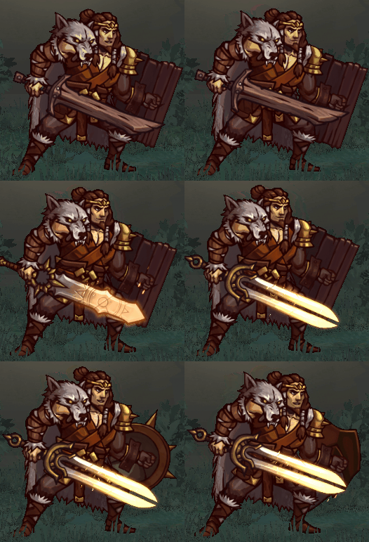
Weapons and shields are easily swapped by enabling and disabling additional skins.

Weapons are an obvious application of this, but we can do more outlandish stuff with this. If an enemy gets hit by a knife that applies a bleed effect (damage over time), then we would like to have an effect on the enemy for the duration of the bleed effect. In Awesomenauts we were heavily limited in these kinds of effects because the sprite sheet didn’t tell us where any of the limbs or feet of the character were. This meant status effects needed to be visualised with animations that are always centered on the character. In Blightbound we can do much better: we can have a knife sticking our of a leg, and the knife will move correctly with the leg. All it takes is adding a skin to the enemy that contains that knife.

Normally we put textures in skins, mostly body parts and clothing and weapons and such. But we also have a feature to attach any in-engine animation to a skin. This allows us to do things like adding sparkly particles to a staff, dripping blood to the knife, glows to the shackles, trails, and even physics capes. We also use this to attach gameplay dummies to skins, for example to make sure projectiles come out of the tip of the staff, no matter where that staff is in the current animation.


The skin system allows us to accurately attach visuals for status effects to the animation. Here the slow effect attaches to the legs. Also, the cape is a nice example of attaching a physics object to the character.

A fun but mostly unused feature I implemented is the scaling of parts. Skins can not just replace parts, but also change their size. We hoped we could use this to change a character’s silhouette, for example by giving one character longer arms and shorter legs. This feature also allows making all heads bigger (which is a common Easter egg in many games, but we didn’t add it to Blightbound).

While scaling worked fine from a technical perspective, in practice it was hard to make good looking characters this way so our artists ended up hardly using that feature. Also, a more complete implementation of limb scaling requires animation retargeting (for example to keep feet firmly on the ground when the ratio between upper and lower legs is changed), which is some pretty advanced tech that we didn’t have time to dive into.

So far it might seem like just having that skin editor enables all of these cool features. However, to make this work, all animations need to have consistent elements. For example, if we want to attach that knife to that underarm, then each animation that the character can play needs to have an underarm and it always needs to have the same name. In some cases we worked around this by adding empty visual parts to the rig, so that any characters that needed those parts could enable them. This is somewhat similar to adding attachment dummies to a skeleton in 3D animation.

Also, if we want to quickly reskin a character, then we should limit how many unique parts there are. In my previous post I mentioned that we do frame-to-frame animation on parts, for example by drawing several heads with different expressions. For every new character we add on this rig, we need to draw all of those heads. The larger the number of parts, the more work it is to add a new character that replaces all of those parts.

There are some tricks that we used to decrease the workload. For starters, our skinning system falls back to the default if variations don’t exist. If for example one character has a mask, then we don’t need to make copies of that mask for different facial expressions. If a character is less important then we can also just choose to not draw the facial expressions for that character, even if they wouldn’t be hidden by a mask.


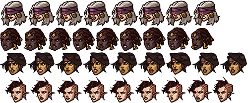
For each character we need to draw all the parts used in all their animations. For four characters in Blightbound this shows all the heads needed for the female rig. Note that some characters have one head fewer. That's okay because in such cases our skin system automatically falls back to the default.

Another thing we used is that not all characters use all animations. Enemies for example share some animations with heroes, but their animation set is a lot smaller. Enemies therefore only need to have the parts that are actually used in their animation set. For this same reason our animators had a lot more flexibility in adding parts whenever they made a character-specific animation: none of the other characters need to have those parts.

By carefully choosing which parts and variations are really needed, our artists managed to keep it all doable. Still, in total Blightbound currently has over 4,600 character parts. Together these form around 50 characters (players and enemies), 104 weapons and 45 shields.

This did require a lot of experimenting with exactly how a body is made up. While the basic parts may seem straightforward, there are a lot of subtle choices to be made. For example, feet are split in the front part (including the toes) and the back part, and the pelvis and torso are split. Also, some parts are in the rig twice: once in the front and once in the back, for more clothing possibilities.


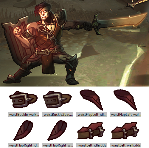
Our artists spent a lot of time figuring out exactly how the rig should be split into parts to be able to do a lot of poses and clothing variations without introducing too many parts. For example, here we see that the belt is split into 3 parts and there are "waistflaps" in the rig.

This brings us to the biggest downside of this approach: it adds a lot of limitations to what our animators can do. For each animation they need to creatively reuse the existing parts as much as possible. They can add new parts when it’s really needed, but they need to be very conservative with this to avoid bloating the workload. The result is that animations are a bit less dynamic that in Awesomenauts and Swords & Soldiers 2. Also, our artists generally did not enjoy the extra challenge of these limitations.

Another downside is that reusing animations makes characters a lot more similar visually, and limits what we can do in terms of body types. Our artists did go out of their way to make the characters as visually unique as possible within the limitations of the rig, for example by adding variation through extreme headgear, capes and clothing.

To make characters feel more unique, our artists have made select unique animations for each hero. Especially the idle animations are different, but in some cases also the walk animations. That’s one of the nice things of reuse: during development you quickly have a full character in the game with all animations, and then later on you can replace specific animations to make them more unique.


To make characters that use the same rig less samey, most have a unique idle animation.

Animation reuse is also great for prototyping: if for example a designer wants to try swapping skills around between enemies, they get an animation set for free to get a better idea of what gameplay feel that will have. In Awesomenauts on the other hand that often required an artist to make some extra concept frames for skill visualisation.

Before I finish this blogpost I would like to point out that the Skin Editor and the limitations we applied to be able to reuse animations are not necessary when using After Effects and Duik for animations. It’s perfectly possible to let go of all of those limitations and still get all the benefits that I discussed in last week’s blogpost. In fact, our After Effects exporter is technically capable of exporting Awesomenauts characters without using sprite sheets.

Despite the downsides, the scope of Blightbound would not have been doable for us without the approach we used. The combination of the Skin Editor and the consistent body setup that our artists applied to all animations made a lot of cool things possible for Blightbound. We were able to make more characters then we could otherwise have, create swappable gear, add special effects to weapons and attach animations to body parts. In total, I think the result is pretty spectacular. Also, playing around with the Skin Editor is just plain fun!

To conclude, here’s a video that shows what happens when you repeatedly randomise all parts of a character:


The Blightbound dev tools contain a feature to randomise skins. The results look both horrible and hilarious.

Special thanks to Ronimo artists Koen Gabriels, Tim Scheel and Gijs Hermans for providing feedback on this article.

Saturday, 13 March 2021

New song: The Remains of the Mountain

Here's my newest song! It's an atmospheric piece, more ambiance than real song. I think the atmosphere is pretty strong on this one, I hope you like it!


Visit music.joostvandongen.com for an MP3 download of this song.

This song is actually an improvisation I recorded back in 2014. It's four layers of cello and one layer of... a pan's metal lid! Because why not.

Back in 2014 I liked the result, but it was too rough to use. I didn't think I'd manage to capture the same feel if I were to extensively practice the piece and record it again, so I abandoned this piece. Since then I've learned a lot more about editing recordings and fixing issues. Especially, I recently bought Melodyne, which is a great tool for fixing incorrect pitch and timing in recordings. With this I managed to get this song to a point where I'm actually happy with the result.

Also, here's a little bit of advanced music theory that I applied in this song. This song contains a bunch of very long chords without any vibrato, so the exact pitch of the chords is very audible. The opening chord for example is a major third. If you make that pitch perfect for modern tuning, the chord is actually slightly out of tune. I explained that years ago in this blogpost, but I had never gotten around to actually applying that knowledge. Now, using Melodyne's precise pitch control, I finally could. I've pitched the top note of the opening chord slightly lower than it would be on a piano, given the major third chord just intonation (also called "pure intonation"). While it's possible to play like that right way, my cello skills aren't good enough to control the pitch I'm playing that precisely in a recording.

Similarly, the minor thirds, fifths and major sixths in this song are also just intonation. Unfortunately Melodyne couldn't figure out some of the chords, so I couldn't apply it everywhere.

Oh, now that I'm talking music: my album is coming out in just two weeks! It will release on streaming platforms (Spotify, YouTube and others), and I'll also sell it on CD, including a bonus disc without the narrator. Send an email to joost@joostvandongen.com if you'd like to buy a physical copy. It doesn't contain The Remains of the Mountain, but it does contain 47 minutes of other awesome cello pieces I composed. I'm really looking forward to finally sharing it with the world!


The CD edition of my album contains a 16 pages booklet with art by Marissa Delbressine, and a bonus disc with a version of the album without the narrator (so purely instrumental).

Wednesday, 10 March 2021

Finding a suitable toolchain for animating Blightbound’s 2D characters

For Blightbound our technical ambitions for the 2D animation system were quite lofty: we wanted high quality animation, screen-filling bosses, crisp character art, high framerate and swappable gear. This required a complete rework of our animation pipeline, since the sprite sheets we used in Awesomenauts and Swords & Soldiers 2 allow for none of those requirements, except for high quality animations. In today’s blogpost I’d like to explain the problems we faced, and what combination of tools we chose to solve them. This is the first half of a two-parter: next week I’ll discuss our skin editor and its implications on animation.


Blightbound features huge screen-filling bosses that need to animate smoothly without taking up insane amounts of memory.

Traditionally 2D animation in games is done using sprite sheets. A sprite sheet is simply a big texture with all the frames for all a character’s animations in it. Sprite sheets aren’t limited to just character animation: they can also store other things, like special effects or plants. The frames might be in a grid, or spaced more efficiently like we did for Awesomenauts. In any case, it’s just a series of tightly packed images.

Sprite sheets are great because they allow for complete freedom. The animator can draw anything they like and it will just work. Extreme squash-and-stretch? Perspective changes? Morphs? Do as you please, to the game it’s all just images!

However, sprite sheets come with a few huge downsides. First is size. If you have a big character and want it to be crisp and high-resolution, then each frame is going to take up a lot of space. Having lots of large images is going to cost too much memory. In Awesomenauts this was indeed a problem for some of the characters. For Clunk to fit in one 4096*4096 sprite sheet (the maximum we chose for memory and compatibility reasons), we had to either lower the resolution a bit, or reduce the framerate. And that’s not even that big of a character! The high memory usage of sprite sheets means that screen-filling bosses either can’t be done, or need to have very few frames, or can’t be crisp.


In Awesomenauts, red Clunk occupies an entire 4k sprite sheet texture for all his animation frames. Clunk fit only after slightly downsizing him.

The second major downside of sprite sheets is that since it’s just images, it’s very hard to do anything with them except simply showing them. For Awesomenauts we’ve often talked about letting players customise characters by changing for example their hat or other parts, but simple sprite sheets make that incredibly hard. The engine would need to know where the hat is exactly, but the sprite sheet doesn’t contain that information. Nor does it tell us whether there are different perspectives of the hat in different frames, or whether anything is ever in front of or behind the hat.

I can think of some workarounds for this problem, but it’s all so cumbersome that’s it’s not practical to actually do. This is the main reason why Awesomenauts only contains skins that swap the entire look of a character, and no swappable hats or clothing: those would be completely new sprite sheets for each combination.


Since every skin change in Awesomenauts requires an entire new sprite sheet we decided to make full reskins instead of allowing the user to customise individual parts (like hats or weapons). These are the four looks for Ted McPain.

So, sprite sheets can’t give us four of our requirements (screen-filling bosses, crisp character art, high animation framerate and swappable items). What can we do instead? The obvious direction for a solution is to split a character in parts, and let those parts move relative to each other. Or even to go for full skeletal animation.

If you have a background in 3D animation, you might think “well skeletal animation of course, it’s awesome!” And in 3D it is indeed, but in 2D it’s a lot more limited. Because we’re restricted to the 2D plane, there’s a lot of animation that can’t be done with a standard skeleton in 2D. Rotating the head of the character away from the camera is super easy in 3D, but impossible with 2D skeletal animation. Swinging a sword vertically is easy, but horizontally is very hard because that requires 3D perspective. Wanting to circumvent these limitations, we opted for a combination of 2D skeletal animation and traditional frame-to-frame animation on parts where needed.

A common tool for doing part-based 2D animation is Spine. Spine is used by a lot of games and we expected this to be our best option. We tried Spine and it was indeed quick and easy to use, as well as easy to integrate into our own engine. However, it turned out to be a bit too simple: Spine doesn’t allow swapping a part in the middle of an animation. This is needed if you want to mix skeletal animation with frame-to-frame animation, for example by switching to a different drawing of a head or hand. The workaround was to layer several skeletons on top of each other, but that was too clunky to work with. We reached out to Spine at the time, explaining this issue, and they confirmed this was the only way. Our evaluation was three years ago and we haven't tried Spine since, but according to this post by them their options for combining frame-to-frame with skeletal animation seem to have improved recently.


Spine by Esoteric Software is a 2D character animation tool for games for creating animations using parts, skeletons and deformations (screenshot taken from one of Spine's tutorial videos).

We also tried some other tools, including Blender and 3D Studio MAX, but those turned out to be too focussed on 3D to create a good workflow for 2D animation for us. Especially the nice skeletal systems they have became quite impractical when used for 2D animation.

So instead, we wanted to stick with After Effects. After Effects is mostly known as a tool for editing video and doing special effects and such, but it’s actually also just a really good general animation tool. Our artists happily used it for character animation in our previous games Awesomenauts and Swords & Soldiers 2. The basic idea is this: each part in an animation is a layer, and can be animated, linked and deformed freely. By turning layers on and off, you can do frame-to-frame animation on parts (like a hand opening and closing) or on the character as a whole.

I imagine After Effects would be a bad fit for full hand-drawn frame-to-frame animation, like in Cuphead, since After Effects doesn’t even allow drawing on layers directly (we draw all our parts in Photoshop). However, for our games it’s an excellent tool because we don’t want to redraw the entire character every frame anyway.

There was something missing though: After Effects is a great animation tool, but it’s not really tailored to 2D character animation. Good thing we already knew about the Duik plug-in. Duik adds the rigging features that are common in 3D animation to After Effects. Combined with the strong tools After Effects already has, it’s a really effective 2D animation tool for games.


Duik is an After Effects plugin that adds tons of 2D animation features (screenshot from this tutorial video by Motion Tutorials).

I previously mentioned we wanted to mix skeletal animation with frame-to-frame animation. That part is actually really simple with Duik. The artist just links several drawings of a part to a bone and switches which is visible. This way we can change facial expressions during animations, as well as do things like open and close hands, pivot or distort a torso and switch facial expressions.


Thumbnails of most animation parts needed for one character in Blightbound. The various hands, faces and chests are for frame-to-frame animation on parts of the body.

Happy with After Effects+Duik as our animation tool, another important thing was missing: After Effects files can’t be played back in real-time engines. So I set about the task of writing an exporter from After Effects that exports all the hierarchy and animation data. I also implemented the in-game side of playing that back in real-time.

At it’s core, this is a surprisingly simple task. Each part in an After Effects animation is a layer and we can just export all the layers with their animation frames and play them back. Where I went wrong though, is that I wanted to emulate Duik’s systems in-game. I thought Duik only did basic two-bone inverse kinematics and implemented that in the engine. This worked with simple animations, but for complete characters the animations were completely broken in-game. When I looked deeper I learned that Duik actually has a ton of different animation systems and approaches. Mimicking all of those in-game was totally undoable.


Duik has so many features that only supporting parenting and two-bone IK produced completely wrong results in-game, as can be seen in this 'beautiful' monstrosity. This was intended to be a normal walk animation, early during development of Blightbound.

Once I realised this, I went for an easy alternative: animation baking. I export the orientation, scale and position of each part at 30 frames per second, simply storing the values for each frame (unless they’re not changing). This is a lot more data, but compared to the size of textures it’s really negligible. I did keep the hierarchy of the bones, so parts don’t start to subtly 'float' compared to each other.


Our custom file format is simply a text file with a long list of all parts and the information needed to position and animate them correctly, including parenting and keyframes.

I previously said we wanted high framerate. The game actually interpolates between these frames, so while they’re exported at 30fps, they’ll also run smoothly at 60fps, 144fps, or any other framerate. That’s also great for when slowing an enemy: in Awesomenauts, if you slow an enemy, you can see the low framerate of their slowed down walk animation. In Blightbound, movement remains perfectly smooth.

A note there is that whenever something needs to jump from one position to another instead of smoothly interpolating there, the artist needs to use a hold key. Our tool exports those and applies them correctly during playback. Overlooking this caused some bugs here and there, because artists aren’t used to needing to use hold keys when two frames are directly next to each other. In-game however there can be frames in between, so that case still needs a hold key.


A few animations that Ronimo animator Tim Scheel made for the Blightbound character Karrogh.

After Effects is a huge tool with tons of features, so it’s impossible to support them all in-game. Our exporter only supports what we actually need, and nothing else. This means our artists need to avoid using some After Effects features that they might want to use. In most cases this is fine, but one particular feature that we ended up not supporting due to a lack of time, is mesh deformations (also known as puppet pins). Being able to deform a part would have helped a lot, but we didn’t find the time to implement a good emulation of After Effects’ deformation features in-game. Quite a pity, and I wonder whether our artists have ever wished they had chosen Spine after all, since Spine supports deformations in-game out-of-the-box.

Our artists did apply a simple workaround for the lack of deformations. By doing them in Photoshop and saving them as different frames for a part, they work fine. Technically the engine then thinks it’s frame-to-frame animation, but it’s actually deformed instead of redrawn in Photoshop. This approach wasn’t used much because it requires a lot of handwork, especially when reusing animations on several characters, but it does get the job done when needed.


The chest deformation in this animation from Blightbound was made by deforming the chest part in Photoshop and then exporting it as separate parts.

From a memory perspective the result of our toolchain is pretty impressive. Whereas a single Awesomenauts character can take up 16mb of texture space (excluding skins and the blue team), all Blightbound characters and enemies together use only 65mb of texture space, spread out over 4,600 character parts. On top of that, Blightbound animations are much higher resolution and higher framerate and we can swap parts and weapons dynamically.

What we have so far is strong animation tools (After Effects + Duik) and a way to play animations back in-game. This is enough to make a playable game, but we wanted considerably more: easy reuse of animations between characters, equippable gear, attaching special effects to bodyparts and efficiently handling thousands of character parts. In next week’s blogpost I'll dive into how we achieved those goals using our own skin editor.

Special thanks to Ronimo artists Koen Gabriels and Gijs Hermans for providing feedback on this article.