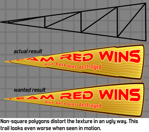
If you're not very familiar with how videocards work this looks really weird. To a human it is very clear how the texture should be squashed when tapering a polygon, why can't my computer figure this out?
The reason is that videocards only handle triangles. They don't really know what a square is so if you want a square, you need to create two triangles that happen to form a square together. Many 3D tools hide this, but that's what happening under the hood.
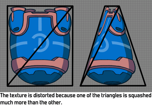
When applying this taper to a square that consists of two triangles we can see why the weird distortion is happening. Those two triangles aren't the same size anymore: one gets squashed much more than the other. Since half of the texture is on one triangle and the other half is on the other triangle, we get this ugly malformed texture.

Another way of looking at the problem is to look at the centre of the image. The middle of the diagonal corresponds to the middle of the texture. But if we taper, then the middle isn't quite the middle of our object anymore!

Does this mean all deformed polygons always look broken? Luckily not: this problem only occurs if the texture has a different shape. If you apply a tapered texture to a tapered polygon it will look fine. The problem occurs when applying a square texture to a tapered polygon.
Now that it's clear what the problem is, how do we solve it? My first thought was to do something with shaders and modifying the texture coordinates to compensate. Maybe I could do away with explicit texture coordinates altogether and define the texture placement through a formula instead? I expect this should be possible somehow, although handling more complex geometry like trails might be pretty hard. Also, this seems overly complex and might cost additional performance: calculating the texture coordinates in the pixel shader would cost additional fillrate. Fillrate is the main performance bottleneck in Awesomenauts so anything costly there is probably problematic. (Note this older blogpost about fillrate in Awesomenauts.)
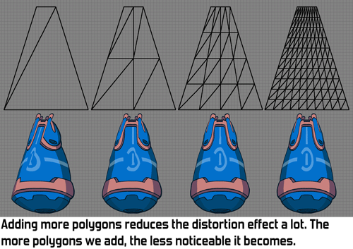
There is a much simpler solution: more polygons! If you subdivide the quad into a bunch of smaller quads the distortion becomes much much less noticeable. After a couple of subdivisions the distortion is usually hardly visible anymore. It isn't actually gone, but if the player doesn't notice it then it's good enough!

Note that a much more efficient subdivision for this particular situation is also possible by not doing a grid-based subdivision. For example by adding a second diagonal, creating a cross with 4 triangles. (Thanks to Reddit users eggfruit and not_a_profi for pointing this out.) A grid-based subdivision is more flexible though as it can also be used for other things than just solving this particular problem.
Solving problems by throwing more polygons at them is generally not a good idea, since those polygons of course cost more performance. However, our games generally use very few polygons so that's not where the performance bottleneck is for us. Also, we don't have all that many objects that need this solution, so the performance impact is negligible. Here we see a common pattern in modern game development: computers are so fast now that many things that may seem like a performance waste really don't matter, unless you're making triple-A games and are trying to beat the competition in squeezing the most effects out of the hardware.
So there you have it: I've solved this problem by simple throwing more polygons at it! Adding an option for subdivisions to the Ronitech (our own engine) had been on my wishlist for quite a while, so this felt like a good excuse to finally do so. This not only fixes the texture distortion problem: now that we have this option we could also add other fun features, like an animatable bend. I have even been playing around in my spare time with using those subdivisions for 3D heightmaps to add depth to objects in Awesomenauts. My tests show this could look really awesome, but this is not in a state where there's anything to show yet. Maybe that will make for a nice future blogpost somewhere next year. ^_^
Nice. A grid divide is the predecessor of the geometry shader of course. As a bonus, this technique in SW is supported on all hardware.
ReplyDeleteI'm interested in the way you could subdivide the tapered rect more efficiently than a grid based layout?
On Reddit someone named "eggfruit" mentioned this, which is probably a much better idea than my implementation for this specific problem:
Delete"So why didn't they just add another edge from the top left to the bottom right corner, so you end up with 4 tri's?"
This one from "not_a_profi" might be even more better:
"Also why not use as many isosceles triangles as possible? It will allow to keep center in place even with 3 triangles and may improve pictures with bigger number of triangles."
Under some circumstances it couldbe solved by using additional texture coordinates, see http://stackoverflow.com/questions/15242507/perspective-correct-texturing-of-trapezoid-in-opengl-es-2-0
ReplyDeleteInteresting approach, thanks for linking! :)
Deletetex2DProj(texCoord, 1/stretch);
ReplyDeleteDone
I saw projective texturing mentioned elsewhere as well and haven't tried it myself yet. I'm curious whether that has the same effect though: does it also add perspective, or does it only do the squashing? What I mean by that is: if I squash the top and correct it using projective texturing, does that only have a horizontal effect or does the texture also change vertically as it there were real perspective? If the latter is the case then this would not be the same effect as what I'm trying to achieve here.
Delete