In 3D games perspective is often treated as a given; a law of nature. But it doesn’t have to be that way: with some shader trickery or clever modelling, perspective can be manipulated to achieve certain compositions that may not be realistic, but look more interesting and are still convincing to the player. One such example is how we kept the horizon on screen in our new game Blightbound by subtly bending the world.
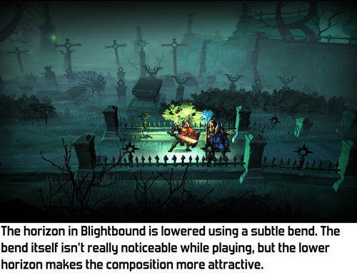
At Ronimo we come from a world of 2D games. In 2D, composition can be whatever you like. That’s why our art director Gijs Hermans may sometimes want to ignore standard perspective rules and instead looks at what he wants to achieve visually. Thus early in development Gijs came to me and said he wanted the camera to look down quite a bit, but still have the horizon in view. In fact, he wanted the horizon to be quite a bit below the top of the screen. His reasoning was that visuals look much better when you don’t see just the floor most of the time. Het position of the horizon is an important tool for shaping a composition.
The origin of this request is a clash that often happens in game development: pretty visuals versus gameplay clarity. Our artists spend a lot of time on achieving both goals simultaneously. A very successful example of this is the way gameplay objects and backgrounds are drawn in a different style in our previous game Swords & Soldiers 2, as I described in this blogpost.
In a game where depth matters, like Blightbound, a low camera is problematic because it makes it difficult to see whether you are standing in front of an enemy or behind them. A high camera solves this, but a high camera removes the horizon from view, making the image a lot more boring.
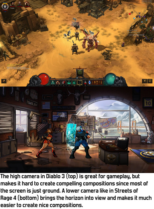
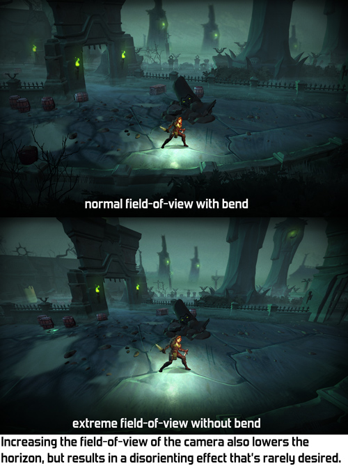
When Gijs came to me with this request, I thought of two possible solutions: either give the camera a wider field-of-view, or bend the world to move the horizon down. We tried the easiest solution first: wide field-of-view. However, it turned out this needed to be set so wide that the entire perspective looked skewed. Extreme field-of-view often isn’t very pretty and it definitely wasn't in Blightbound.
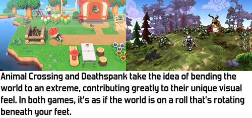
The alternative I came up with is bending the world down the further it is from the camera. This is an effect that’s used in a bunch of games to create a sense that the world is very small, making the world feel cutesy and funny. However, Blightbound is intended to be a dark fantasy game, definitely not something cute and funny, so we didn’t want anything that extreme. I figured that with some tweaking it might be possible to achieve a more subtle version of this that still keeps the horizon in view but doesn’t have the funny vibe.
My implementation of this effect is quite simple. In the vertex shader I bend down the world depending on the Z-position of the vertex in the world. The nice thing of implementing it this way is that our gameplay code and level design tools can assume a flat world, making them a lot simpler. The bending only exists during rendering, so gameplay logic doesn't need to take it into account.
A minor challenge in implementing this bend is how to handle lighting and shadows. When the camera moves forward and the world bends, we don’t want the lighting on objects to change, since that would make the bending very obvious and would make the player focus on the backgrounds instead of on the gameplay. Also, objects in the background shouldn't be more bright because they are rotated towards the light by the bend. My solution was to calculate all lighting, shadows and fog as if there is no world bend.
Also, a little technical note: since the bend happens on the vertices, objects need to have enough vertices. A big square plane for the ground with no vertices in between can’t be bent. Occasionally this caused bugs where a small object would float above a big object because the big object didn’t have enough vertices to be bent correctly.
The bend effect is quite fun to see in action when set to an extreme value. However, any kind of geometric deformation is quite noticeable when the camera moves, so we chose to fix the bend in the world instead of letting it move with the camera.
A few different settings for the bend, including the final one used in Blightbound.
As you can see in the video, the bend effect is kept quite subtle in Blightbound. We didn’t want that cutesy/funny effect at all, since this is intended to be a dark fantasy game. Our level artist Ralph Rademakers tweaked the effect and the camera a lot until he got it to a point where it felt like there was no bend at all, just a natural camera. However, if you compare with and without bend, you can see that the bend makes a huge difference in what you actually see. And that’s exactly how it was intended: achieve the desired composition but don’t make it look like anything weird is going on.
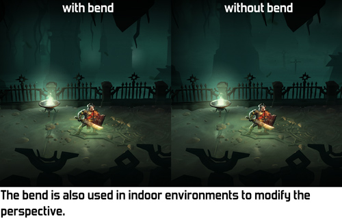
And then came the fog! The bend effect was implemented when we hadn’t figured out the lore of the world yet. We didn’t know then that we would want to have so much fog. In fact, the working title of the game used to be AwesomeKnights instead of Blightbound! Once we finally decided on the lore we knew that the world of Blightbound is covered in “blight”, a corrupting fog. To match that, Ralph added a lot of fog to all the levels. This creates a great atmosphere, but… hides the horizon!
Does that make the world bend useless? No, definitely not. It's still used in quite a few levels to change the perspective and have a more horizontal view on the background, even if we can’t see as far as before. It’s a more subtle tool than originally intended, but still a very useful tool.
I think the bend effect we used here is a wonderful example of the kind of graphics programming I enjoy most: looking at what’s needed from an artistic standpoint, and then making tech that achieves that. I’m personally not very interested in realistic rendering: 3D is just a tool to make cool art, whatever the shape or type. The bend technique used here makes no sense whatsoever from a physical standpoint, but it adds to making Blightbound a prettier, more compelling game.
The video isn't showing up for me in the post, but I think it's here: https://youtu.be/ksdtB5h7pHc
ReplyDeleteThat's weird! Can you see the video when you visit that link? That is indeed the correct video. I haven't heard from anyone else that it's not working. Are the videos in this post working? http://joostdevblog.blogspot.com/2020/10/screen-space-reflections-in-blightbound.html
Delete