Showing posts with label DoF. Show all posts

Saturday, 18 October 2014

Area based depth of field blur

While working on the visual style for my weird live performance game Cello Fortress I came up with a new technique for depth of field blur: area based depth of field blur. As far as I know this is not an existing technique so today I would like to explain how it works.

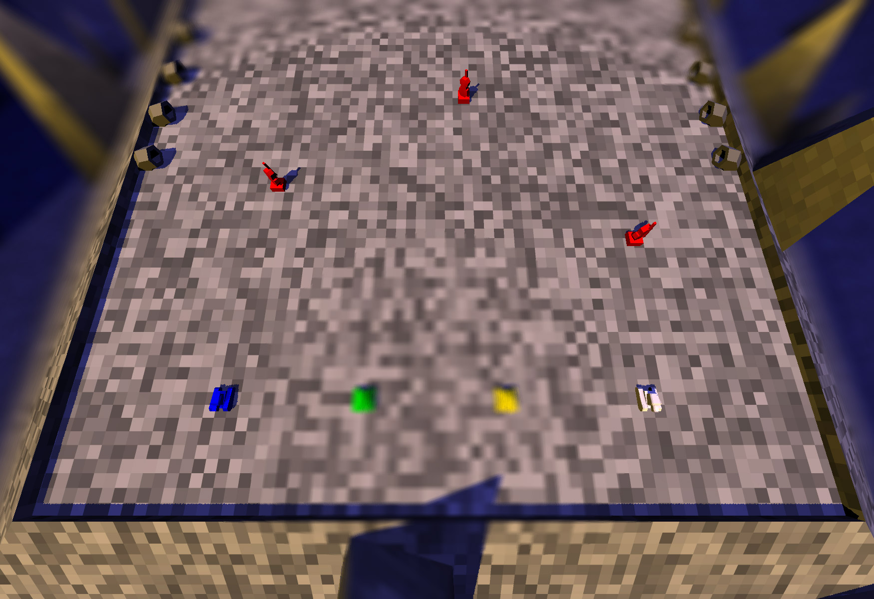
The visual style for Cello Fortress is far from finished at the moment, but I decided early on that I wanted strong depth of field blur to play a major role. I had already implemented depth of field blur for Proun (which by the way is coming to 3DS, iOS and Android soon!) and I copied that to Cello Fortress. Proun does not have blur on the foreground, so I added that and tried it in-game. The result turned out to not work at all, as you can see in this image (be sure to click the image for a larger version, since this is difficult to see in these small blog-sized images):


click for larger image


The problem is that with standard depth of field blur, only one specific distance to the camera is sharp. In Cello Fortress the camera looks down on the battlefield diagonally, which means that that specific distance looks like a circle. Even weirder is that the part of the screen that is closest to the camera is almost at the centre of the screen: that is the spot the camera hangs exactly above. The result is that both the edges of the screen and the centre are blurred. Of course it is totally undesired that the centre of the gameplay would be blurry.

A simple solution I then tried was to broaden the area that is sharp:


click for larger image


click for larger image


The goal was to have strong depth of field blur as a core part of the visual style for Cello Fortress. So far we either have depth of field blur that interferes with the gameplay, or no depth of field blur at all in the foreground. We need something better:


Once I drew where I wanted blur I realised that this is a simple shape: in world space this is just a simple axis-aligned box. So I implemented a shader that calculates the strength of the depth of field blur based on its distance to that 3D box, instead of distance to the camera. The result is exactly what I was looking for:


Click for larger image.
Note that the effect is exaggerated in the smaller screenshot above, the full-res version has the normal, slightly less extreme blur.

A big benefit of this technique is that tweaking it is really straightforward, and that it is independent on the camera. I can easily set the sharp area from code based on the gameplay situation. It also gives me precise control over the height at which the blur starts.

Technically area based blur is quite easy to do. The depth of field blur shader already uses a render-texture that contains the depth of each pixel to the camera. I don't use this depth for anything else, so I can put any value I like there. The pixel shader can easily be adjusted to calculate depth in a different way.


This concept can also be applied to other shapes than boxes. For example, you can also have a sphere within which everything is sharp, while everything outside that sphere is blurred. One can even have several such spheres. How about a visual style where everything is blurred except for the areas around the characters? I think some other interesting visual styles can be made this way, especially in combination with very strong blur.

I have seen some games that use non-distance based depth of field blur, like the beautiful Below, which seems to simply blur the top and bottom of the screen. I am not aware of games that use a 3D area as I use it. Let me know if there are other games that already do this.

The fun of writing your own shaders is that you can bend them to do whatever you want, including weird and unrealistic effects like doing my depth of field blur based on a 3D box area. Feel free to use this idea in your own games, and I'd love to hear from you if try it out!

Friday, 29 August 2014

A simple trick for fast high quality bokeh on lights in Cello Fortress

Bokeh is an effect that pops up in a lot of new games. It is one of those effects that makes a game instantly feel a lot more "next-gen". It is also an effect that usually eats up a lot of performance. For Cello Fortress I came up with a simplified version of bokeh that looks really high quality, is very fast to render and even very easy to implement. My implementation also has some severe limitations, but I think it can work really well for many games.

Bokeh is a part of focal blur, which is also known as depth of field blur or DoF. DoF is the effect that only objects at a certain distance are sharp, while everything closer and further away is blurred. This is an effect that every lens has, and the larger the lens is, the stronger the blur is. Focal blur has been done in many games for quite a while now, but with the normal DoF rendering techniques the bokeh effect is usually lost. Bokeh means that extremely bright spots grow with the blur and appear as clearly recognisable circles (or hexagons or other shapes, depending on the shape of the lens).


Image from HDWallSource.com.

The problem with rendering bokeh in games is that a naive implementation requires high dynamic range (HDR) rendering and an extremely large amount of blur samples. HDR has become quite common in games by now, but taking enough samples to get good sharp bokeh is impractical. For bokeh as large as in the image above, you would probably need many hundreds of samples to get it look smooth. I actually tried that exact thing in Proun two years ago, as a fun little experiment.

Proun already had really high quality DoF (as I described in this blogpost). I added bokeh by simply making some pixels extremely bright. This is a quick dirty trick that was needed because Proun only has limited fake HDR, but the effect looks pretty convincing, as you can see below on the left image. However, if the blur is increased the bokeh becomes extremely noisy, as you can see on the right. It looks noisy despite that it already uses a quite insane 128 samples per pixel! You can find more images of this approach in this blogpost.


This makes this naive approach unusable if strong blur is wanted. We need something smarter. The most common approach in current games seems to be to render actual polygons with a bokeh circle texture on them. To do so we need to find all the bright pixels in the image and then generate a quad for each one.

According to this article The Witcher 2 was ahead of its time by having bokeh all the way back in 2011. The Witcher 2 did this by generating a quad for every pixel and then discarding the ones that are not blurred enough. That's a whole lot of sprites to render! Needless to see this only worked in real-time on the very fastest PC videocards.

Most games that have bokeh these days seem to use a smarter approach, using newer shader models: first they look for all the pixels that are so bright that they would get a clear bokeh circle, and then they generate quads for this. An example of this approach can be found here. Unlike The Witcher 2's technique this creates only the bokeh itself, not the general focal blur, so with this technique the depth of field blur needs to be done separately.

Even with this clever technique the performance hit is still heavy. It requires analysing all the pixels on the screen to find the ones that are much brighter than the ones next to it. It also produces temporal artefacts: if the source of the bokeh is really small it will flicker because it is smaller than a pixel. Normally this is not that much of a problem because it is only a pixel, but if a big bokeh sprite flickers on and off this becomes much more noticeable. These temporal artefacts might already show with slight camera movements. I don't know what technique Star Citizen uses, but the kind of flickering this would result in can clearly be seen in this video in the bright spots in the background.

Now that we roughly know how bokeh is usually rendered, let's look at that simple and fast trick that I use in Cello Fortress. My idea comes from that the most pronounced bokeh is often from actual lights, not just random bright pixels. If you are looking directly at a light, but the light is in the blurred background, then it will generate a very clear bokeh circle. In general a game engine already knows where all the lights are, so this means that we can skip the searching for bright pixels entirely and directly create one screen-space quad for every light. To do so I first render the scene, then apply normal depth of field blur, and finally render the bokeh sprites on top of that.

Not only does this method skip the expensive step of finding the bright pixels that need bokeh, it also fixes all the issues with temporal artefacts. We always know exactly where the lights are so no matter how small they are, the bokeh will never flicker when the camera moves. It just moves along with the light correctly.


To get a good-looking effect I scale the bokeh with how blurred the light should be. This can simply be calculated based on the focal settings of the camera and the distance to the camera. I also fade out the bokeh sprite a bit as it gets larger, since the larger the blur, the less bright the bokeh circle should be (unless the light is infinitely bright). Here is a video that shows the bokeh in action in Cello Fortress. The bokeh is mostly visible at the bottom of the screen.


An important part of bokeh is the actual shape of the bokeh effect. This shape is created by the shape of the lens. I often like hexagonal bokeh best, but I recently discovered that in photography this is generally considered ugly. When reading reviews of a new camera lens I wanted to buy I learned that the more expensive lenses have circular bokeh while cheaper lenses have hexagons. Still, in the end the only thing that matters is what looks good aesthetically in your game. Since most bokeh rendering techniques use those textured sprites the bokeh shape can be modified really simply by using a different texture.


Note that this all does not look as good as it can yet because I have so far spent too little time on the actual visual design of Cello Fortress. I mostly focussed on the gameplay and some cool shaders. Once I start working on proper graphics I should also tweak the brightness, size and colour of the bokeh to make it look better. I should probably also try adding a bit of chromatic aberration to the bokeh texture then.

My bokeh technique does not solve occlusion at the moment. If a light disappears behind an object then it should not still get a bokeh sprite. I didn't solve this yet because it does not occur in the current version of Cello Fortress. However, several solutions can be implemented easily. For example, I already have a depth texture for the depth of field blur, so I can do a look-up in that on the screen position of the light to see whether there is an object in front of it.

The big downside of my method for rendering bokeh is that you need to know where the bokeh will appear beforehand. This means that more subtle bokeh sources like reflections and strong speculars are not practically doable. I can imagine some tricks to get for example bokeh in planar reflections working (if you know where the reflecting planes are), but beyond that it quickly becomes infeasible. The standard technique of searching for the bokeh pixels of the image handles this much better, so if you really need bokeh on speculars, then you will probably need to resort to such techniques.


Image from this article by MJP

I looked up a bunch of articles on bokeh implementations and couldn't find any mention of something similar to what I am doing. This surprises me because the idea is so simple and obvious. If anyone knows of any articles or games that already do this, then please let me know so that I can add a link.

That's it! My bokeh technique is simpler and much faster than most commonly used methods of rendering bokeh and it even fixes problems with temporal artefacts. It is also a limited technique that does not handle all bokeh effects, but in many cases it will probably be good enough. It definitely is for Cello Fortress!

Monday, 16 April 2012

A fun Bokeh experiment in Proun

I posted about depth of field blur last week and discussing it in the comments got my mind back on the "Bokeh" effect. Bokeh is an advanced form of depth of field blur that is currently used in lots of tech demos to show what the next console generation will be capable of. So that got me curious again as to how Bokeh is made. I have been experimenting with it in Proun and have some nice images to share!

Bokeh is the effect that when there is strong depth of field blur, bright lights in the background become bright spots, often visible as circles or hexagons. This is a real lens effect that can also be seen in photographs, and it looks pretty cool, since it adds some definition to an otherwise completely blurry depth of field blur effect.

A nice example of rendering Bokeh on the videocard can be found in Epic's Samaritan demo. Although the style and look of this demo don't really appeal to me, Epic shows lots of really cool effects here that they think will be possible on the next console generation. That essentially means that these effects are already possible on current high-end PC videocards, and thus they managed to make this run on a single GPU this year.


I was curious about this and wondered how Bokeh is implemented. It turns out there are several techniques to do it, but the simplest seems to be to simply have a really large depth of field blur area, with usually either a circular or a hexagonal shape. So you just take lots of samples in a large area for the depth of field blur, and that's it.

The caveat here is that to get a good framerate, most games use a couple of tricks to render depth of field blur efficiently: blur is calculated in separate horizontal and vertical passes, which massively reduces the number of samples needed for a smooth blur effect. Also, the blur areas are usually kept relatively small to be able to calculate them quicker. Awesomenauts is no exception to this, but Proun actually is: Proun already has a much more advanced form of depth of field blur than most current games and to my surprise it turned out it basically already does the Bokeh effect.

So why are we not seeing those circular splotches in Proun then? The reason is rather simple: Bokeh is seen when small but very bright spots are being rendered with depth of field blur. Proun does not have any really bright and visible lights or spots, so there is nothing that could cause these circles to appear!


Another problem is that Proun's HDRI is limited too much for Bokeh. HDRI is the effect that colours can be brighter than the standard 0-255 range that Photoshop and your monitor usually use. Of course, brighter colours than 255 are simply capped by the monitor, since it cannot show anything above 255, but when blurring in-game, colours brighter than 255 become really important. I wrote a blogpost about that a long time ago and an image I made then explains it rather well:


Now the problem is that in Proun I have used a trick to get HDRI without costing any performance. This trick, however, limited the HDRI to 400, which is above 255, but not far enough above it to really get these bright Bokeh spots. That's another reason why we are not seeing any Bokeh in Proun.

So as an experiment to see Bokeh, I have used a little trick: I just treat all the brightest pixels as if they are even brighter. In the depth of field blur shader, whenever I encounter a colour that is brighter than 300, I multiply it by 100, as if it were really 30.000, which is insanely bright. And indeed, now the Bokeh splotches suddenly become visible!

Since I have cheated this a bit, the splotches are not nice round circles, but still, it is clearly the same effect. It is a dirty hack and thus doesn't look as good as scenes and effects that are really designed for Bokeh, but it does have a funny effect. Here is an example of what my first experiment looked like in Proun:


However, with all those coloured objects in Proun, there are few spots that are actually bright white. So to get more Bokeh, I changed it to handle the red, green and blue channels separately. Now if a spot is bright red, it will create a red Bokeh circle. The way I did this is probably even more hacky and fake, but it actually looks pretty awesome!


I also tried to find the limitations of my Bokeh implementation:


Unfortunately, this hack breaks all kinds of things in Proun and doesn't really work all that well with the rest of the graphics. So I don't think this is actually an improvement for Proun, but I do think this was a fun experiment! :)


And, since Bokeh is all the hype now, I can finally say that I too have implemented it... ;)

Yeah!

Monday, 9 April 2012

Depth of field blur: the Swiss army knife that improved even the framerate of Awesomenauts

Depth of field blur is an effect that is used in many modern games as a cool graphics effect. A nice example of this is of course my own game Proun (for which I discussed the depth of field blur in one of my very first blog posts). However, while making Awesomenauts, I learned that it is much more than just a graphics effect. In fact, it even improved the framerate a lot!


Initially we didn't have depth of field blur in Awesomenauts, but then the first trailers of the beautiful Rayman Origins were released, and they have some levels where they add a ton of depth of field blur to the backgrounds, which looks great. So we wanted something similar, especially as these kinds of effects help make a 2D game look more like "triple A 2D" (for as much as that is an existing term).


Unlike in 3D, doing depth of field blur in 2D is actually incredibly simple. You can just render the furthest objects to a separate texture, blur that, and then render the closer objects on top of that. Since depth of field blur suggests depth to the player, in Awesomenauts I do this a couple of times at different depths, so that the furthest objects get more depth of field blur than closer objects, and thus look like they are further away. This sense of depth works really strongly in combination with the parallaxing and coloured fog that we use on far-away objects.


However, depth of field blur is not just a good looking graphics effect. It also serves an important gameplay purpose. Awesomenauts is quite a chaotic game. This chaos is part of the fun, but amidst that it is very important to make the graphics as clear and readable as possible. Background objects don't have any gameplay impact in Awesomenauts, so by blurring them, we can make them more subtle and make the characters and bullets stand out more.


Readability was actually also an important reason why I added depth of field blur to Proun. Because Proun lacks detailed material textures and recognisable objects, it is difficult to judge the distance towards an object. Depth of field blur compensates for this and makes sure the player always focusses on the nearest obstacles, as those are the only ones that are sharp.

However, depth of field blur is usually also a very expensive effect in terms of performance. Since in Proun the rest of the graphics are incredibly simple and fast to render, the depth of field blur easily accounts for 90% of the total time spent rendering a frame. In 'normal' 3D games this is of course a lot less, but depth of field blur remains a rather expensive effect to render.

However, to my own surprise, in Awesomenauts I actually managed to double the framerate using depth of field blur! The reason for this is that our artists use lots of really large fog gradient textures to make the backgrounds look further away and modify their colours. This looks great, but causes an immense performance hit, because these large fog objects on top of each other require an enormous amount of transparent pixels to be rendered. I have not actually measured this, but I wouldn't be surprised if the overdraw in Awesomenauts may be something like 10!

(Overdraw is how many times on average you need to render a single pixel to get the final image. Ideally, this would be 1, so that you render each pixel exactly once. A higher overdraw generally means a lower framerate, so in 3D, there are tons of interesting techniques to decrease it.)


These fog layers turned out to be a big performance problem in Awesomenauts. At some point the game ran at only 15fps on the Playstation 3, which is a far stretch from the 60fps we were targeting at. We did lots of different optimisations to reach 60fps, but the depth of field blur turned out to be the biggest life saver here. Since I was blurring the backgrounds anyway, I simply made the choice to only render them at the really low resolution of 640x360. This does not reduce overdraw, but simply decreases the number of pixels enormously. To improve the framerate even further, I also moved the depth of field blur forward a bit, so that even the closest background objects got blurred and thus got rendered at a low resolution. Because of the blur, this low resolution looks perfectly fine and smooth in combination with the HD foreground.


This does introduce some subtle flickering in the background as really small objects alternate between being on and in between pixels, but this is only visible if you look for it and know where to look.

I suppose parts of this approach can be (and probably already are) used for 3D graphics as well to do more efficient depth of field blur, although in 3D a lot of technical difficulties come into play to correctly handle objects that stretch into the distance, and thus are partially far away and partially nearby.

So for Awesomenauts, depth of field blur was a true Swiss army knife: it turned out to not only make the game look better and make the visuals more readable, but it also turned out to improve the framerate greatly! :)

Saturday, 18 September 2010

Overbright colours, blur and faking it

Last week I talked about depth of field blur, a very obvious and visible graphical effect in Proun. Now let's look at one that is a lot more subtle: blurred HDRI.

In computer games, colours are usually stored with values from 0 to 255, with 0 being black and 255 being white. Few people realise that this introduces some limitations.

The problem is that when an object is lit by a very bright light, its colour might actually have brightness 400 instead of 255. To solve this, graphics cards usually just round this down to 255, since your monitor or television cannot show anything brighter than that anyway.

But what happens when we blur such a bright area with its dark surroundings? Without blur, a white square with value 255 looks the same as one with value 400, because monitors cannot show anything brighter than 255. However, when blurred, there is a big difference, as you can see in this image:


As you can see here, when blurred, really bright objects should look like they grow: they overshine the area around them. Dark details around overbright objects can even totally disappear this way. In Proun, this can be seen clearly in the white boxes at the start of the first track: in the distance, their black outlines disappear. I love to look at this effect:


Allowing colours to go beyond 255 is called HDRI (High Dynamic Range Lighting). On the graphics hardware, to make this happen, you can simply turn this on. (In technical terms: switch the render buffer from 8 bit fixed point per colour channel to 16 bit floating point).

However, that is pretty slow, especially on slightly older videocards. So to save a lot of performance in Proun, I faked the HDRI in a pretty easy way. Objects are simply rendered half as bright as they really are and then after the depth of field blur has been applied, the pixels are made twice as bright again. The end result looks just like HDRI, but without the slowness.

There are two drawbacks to this, though: values cannot go above 511, so there is still some rounding down of the colours going on, and when made more extreme (as is done in the tunnels in Proun), artefacts become visible because everything is made so much brighter. Those artefacts are rarely visible in Proun, but they are in this specific tunnel (still quite subtle, so this may be difficult to see on some monitors):


An extra benefit of doing HDRI, is that bright colours combine into new colours when blurred. This is kind of a weird side effect, but it looks really cool in the places where the spheres overlap in this image:


Which reminds me: I need to do something with explicitly coloured glow in a future game. Maybe have a bright brown object with a green glow or something like that. :)

Sunday, 12 September 2010

Depth of field blur in Proun

Proun may not look like it with it's abstract graphics, but there is a whole lot of subtle technology working together to create the distinct visual style of the game. Perhaps the most obvious is the depth of field blur, and since I used a different technique then what is used in most games, let's have a look at that.

Depth of field blur is the effect that certain objects in an image are in focus, while others are blurred. It is used a lot in film and photography to create pretty images and to focus the viewer's attention on certain parts of an image. In Proun, the depth of field blur has two goals: one is that it makes the game look a lot better, and the other is that it helps the user to focus on the objects that are important, i.e. the ones close to the vehicle.

Since Proun has an abstract art style, judging the size and thus distance of objects is difficult. In a normal game, if you see a person, you know how large that person is compared to yourself and based on that, you also know how far away that person is. But how large is a cube in Proun compared to your own sphere? The depth of field blur greatly helps to solve this problem.


For a couple of years now, real-time depth of field blur has been used a lot in games. One game was way ahead of its time, though: Outcast already did it in 1999 (as that awesome game did lots of things years before anyone else).


Precise depth of field blur takes a lot of time to calculate, so as with almost everything, games have to do some kind of estimate that looks good enough. The most used solution is quite simple: first a sharp render of the scene is made, then this is copied and heavily blurred, and finally the sharp image and the blurred image are combined based on the distance to the camera.

The problem here is that most objects are slightly blurred, so something halfway between two images. Taking an average of a heavily blurred image and a sharp one is not the same as doing a smaller blur, as you can see in this image:


So, what would be much better, is if we could change the size of the blur based on how sharp an object should be. Ati proposed this in a paper of their's called Advanced Depth Of Field. Their solution is simple: for each pixel, we take an average of a lot of samples of the vicinity, and the distance of these samples is based on the distance of the object, since that determines how sharp the object should be. This means that for slightly blurred objects, we really do a smaller blur. This works really well and allows for a much better blur. The drawback here is that this is a lot more expensive to render, so this can really only be used if you are willing to spend a lot of performance on depth of field blur.

Another problem that is addressed by ATI's paper is that sharp objects in the foreground should not leak over the background. Almost all modern games have this problem and it adds an unwanted glow around sharp objects, which makes the image look a bit washed. Even the incredibly beautiful cutscenes of Starcraft II have this problem, as you can see here:


One problem with ATI's technique is that it is difficult to do a lot of samples. If the blur would have been the same on the entire image, you could first do a horizontal blur and then a vertical blur. If you do 9 samples horizontally and then 9 samples vertically, then with just 18 samples in total, the result looks the same as if you would have done 81 samples in one step. Splitting horizontal and vertical is not possible with ATI's technique, so to get the same smooth blur, we would need to really do 81 samples per pixel. Way too much for good performance!

Since doing that many samples is a problem, I tried applying a noise to the samples to hide this problem. Although this work technically, it looks bad with Proun's stylised art style. Many games today use noise to hide that they don't do enough samples in something, but these games contain lots of details in the image already, so the noise does not stand out that much. In Proun however, there are hardly any small details in the image to hide the noise, so the noise becomes very visible. Therefore I removed the noise and accepted that Proun's depth of field blur looks slightly less smooth.


In the end, the depth of field blur eats 90% of the total performance in Proun. Since the rest of the game is really simple to render and because depth of field blur is so important for the visual style of the game, I don't mind about that. To compensate, I did add several graphics settings: on Very High, you get 64 samples per pixel, on High 32, on Medium 16 and on Very Low there is no depth of field blur at all. Hopefully older computers are still able to run the game this way.

(For those interested in checking the actual shader code: if you install Proun, you can see the depth of field blur shaders in the file "DofPostEffect.cg".)

As a result of using this technique, the depth of field blur in Proun looks really smooth and precise. Nice! :)