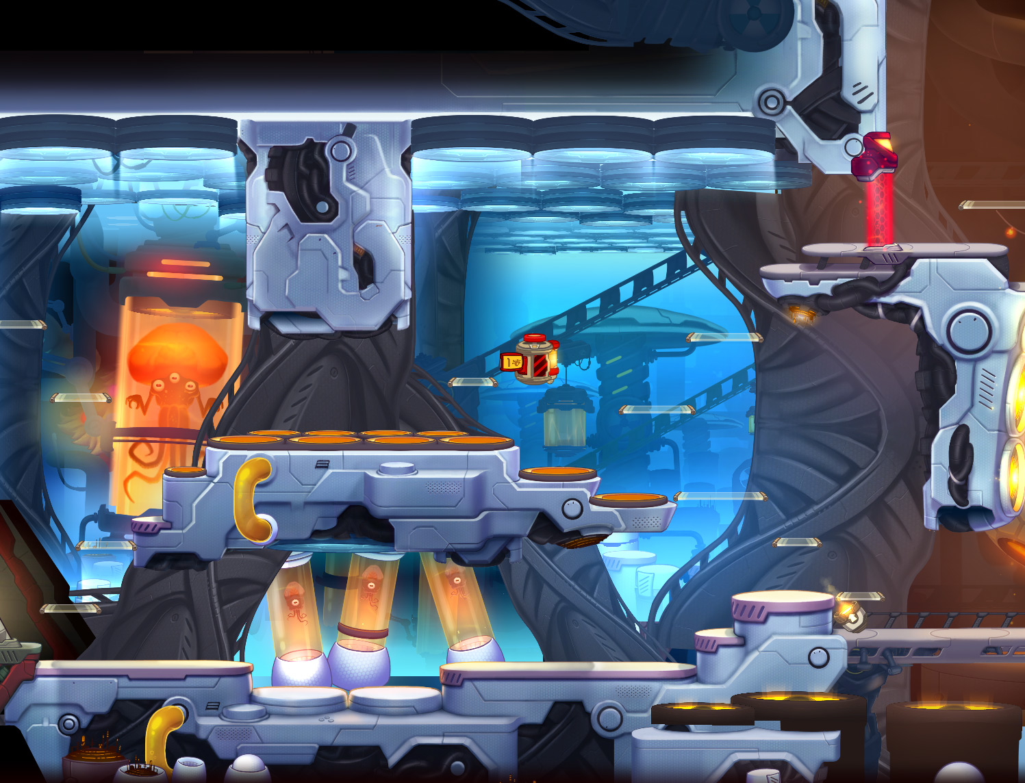
Showing posts with label concept art. Show all posts

Wednesday, 24 November 2021

Neat tricks for modelling the Robo Maestro robot

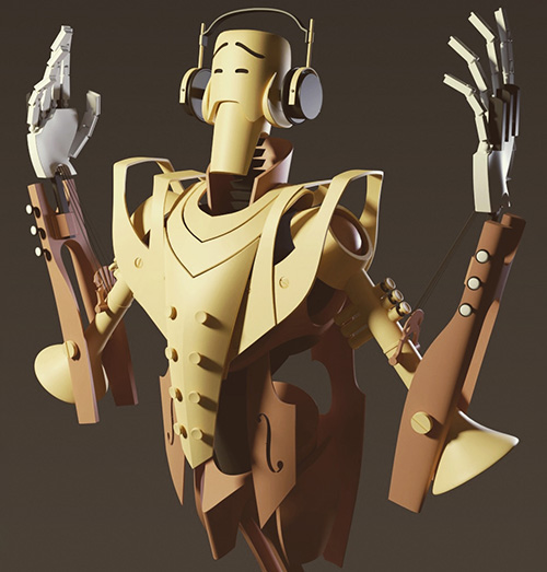
Today I'd like to share some fun, slightly unconventional techniques I used to make the Robo Maestro robot in Blender. I wanted shapes that are both smoothly curved and tight industrial. Hard surface modelling! I think it turned out well, so let's have a look at how it was made!

The concept art I was going by is this rough sketch by Robin Keijzer, creator of the awesome point and click adventure Space Rescue (available on Steam, NSFW!). As you can see, all shapes are a combination of curves, straight lines and hard edges.

Subdivision modelling is a great way of making these kinds of curves, but it's a bit cumbersome when you need hard edges and corners as well. The tip you usually see for getting hard edges is to add supporting geometry: extra vertices around hard edges.

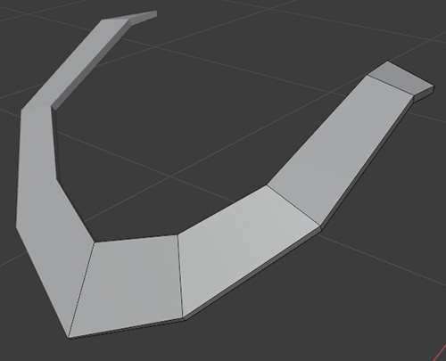
However, the more vertices you have, the harder it is to change the shapes: the model becomes unwieldy. Also, the fewer vertices, the smoother the curves you get. So I really really wanted to have as few vertices in the base model as possible for the best smooth curves.

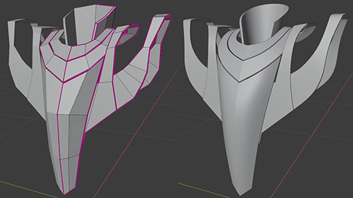
Here Blender comes to the rescue! It has a wonderful feature called "creases" that lets you mark edges that should not be smoothed by the subdivision modifier. This lets us combine hard edges and smooth curves with very few vertices in the base mesh. Very cool, very handy!

Here you can see just how few polygons the base mesh for the Robo Maestro has, and how smooth the curves are that that results in.

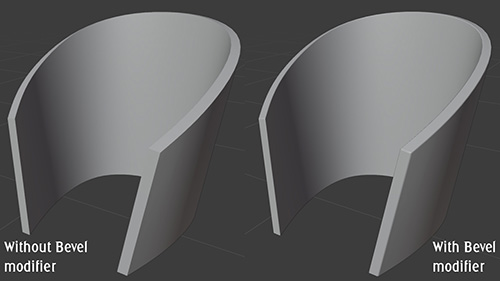
However, 100% hard edges feels cheap and fake 3D. For high quality models, we want to slightly bevel the hard edges. Luckily, Blender can also provide this: we can simply add a Bevel modifier to do this automatically.

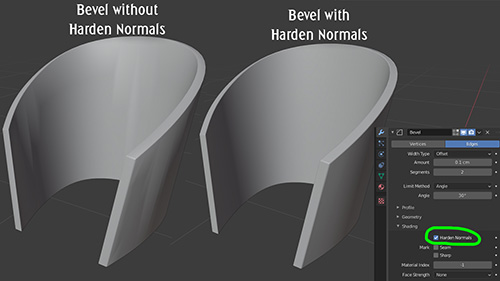
The bevel modifier by default is either one hard edge (still not perfect) or more edges. Adding more edges makes Auto Smooth kick in, which makes us lose a lot of the tightness. The "harden normals" option fixes this (by not using interpolated normals on the bevel edge).

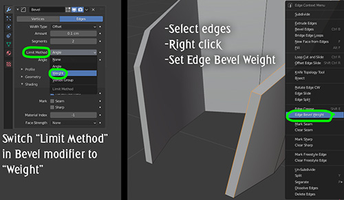
The bevel modifier automatically looks for edges to smooth, but sometimes it gets it wrong. In such cases switch the "limit method" to "weight". Now we can mark edges that need a bevel in our base mesh, and we can even mark per edge how wide the bevel should be. Neat!

Being able to mark edges and vertices with special features that are used elsewhere is one of my favourite features in Blender. Besides "crease" (for subdivisions) and "bevel weight" there's also "seam" (for automatic UV mapping) and "sharp" (for smooth shading).

Combining these techniques I was able to create the Robo Maestro pretty quickly and still remain flexible until the last stages of modelling: Robin had some feedback on the shapes and I was able to change them very quickly because the base meshes have so few vertices.

Finally, if you were wondering what this model is for: Robo Maestro is a procedural music toy that I'm developing for Steam. He even plays the actual notes with his fingers! Here's a little trailer that shows the concept. Wishlist Robo Maestro now on Steam!

Sunday, 30 August 2015

Opinions needed: which art style for Cello Fortress?

The gameplay of my live performance game Cello Fortress is nearly finished, but the graphics are still basic blocks with some crude textures. Recently I've been working on figuring out what style I want for the game, and I've ended up with two possible styles that I like: one dubbed "Surreal Architecture" and the other "Rough Polygons". Since I have a hard time choosing, I figured I'd just ask here. Which style should I use for Cello Fortress?

I've also added the pros and cons of each style as I see them. Several are just my personal taste so let me know in the comments if you disagree.

"Surreal Architecture" style


The basic idea of this style is that you travel through a world of surreal architecture. The surrealism is of the subtle sort: on first sight it might look like normal classical architecture, but if you stop and think for a second you realise this cannot be: buildings are too big and repetitive, it makes no sense to have a city with nothing but church towers, and why is there an area with giant organ pipes?

This style is inspired by the graphic novel series Les Cités Obscures (also known as Cities Of The Fantastic or De Duistere Steden) by Schuiten and Peters. To get an idea of their style, have a look at these beautiful images. To a lesser degree it is also inspired by the Rork series by Andreas (picture).

The main reason to do this style is that I love classical architecture. I haven't done a lot of 3D modelling recently and this kind of stuff is one of my favourite things to model so I'd love to get back to that. The biggest problems with this style are that the link with Cello Fortress isn't very clear, and that it might distract from what the game is all about: the live cello. So the main reason to do this style is that I'd enjoy making it so much.

As concept art I've made some basic environments in 3dsmax and even rendered a video as if it were the game:

Click for high resolution

Click for high resolution

Previz video of the Surreal Architecture style.

Pros
  • More unique and notable
  • Lots of fun to make
  • Very close to me as a person

Cons
  • Lots of work
  • Distracts from game's core (the live cello)
  • Gameplay less readable for players
  • Link between visuals and gameplay less clear
  • Needs serious optimisation for good framerate
  • Doesn't fit style of existing vehicle and turret art very well
  • Not entirely happy with this concept art yet

"Rough Polygons" style


This style is a lot simpler. It is mostly about big, untextured polygons. It has a rough rook and most of the potential beauty of this style comes from the lighting. Using a combination of pre-baked lightmaps and some simple tricks I think I can achieve a global illumination-look as in this image.

A big benefit of this style is that is does not distract from the gameplay. Cello Fortress is such a weird concept that I often need to explain quite a lot to the audience and this style won't distract from the core. It also helps that the gameplay will remain very readable under poor lighting conditions: I often perform with Cello Fortress at festivals and it is not rare to have a beamer projection on a rough wall with too much environment light. Such conditions make the game look a lot less bright and crisp than a normal gaming environment.

Click for high resolution

Pros
  • Very readable and understandable for players
  • Looks good with crappy beamers on bumpy walls
  • Faster to make
  • Higher framerate
  • Fits style of existing vehicle and turret art

Cons
  • Less original / notable
  • Not as much fun to make
  • Strong shadows on the floor might be too dark but are crucial for this look

Why am I not sure which style to choose? The Surreal Architecture style is much more fun to make and would stand out more, but it just doesn't seem like the best choice for the game. It has little to do with the rest of the concept and would distract from what it's all about: the live cello performance.

Which do you think I should make, and why?

Saturday, 25 July 2015

Using key poses to prototype character animations

When creating a new game character it's crucial to get a feel for his in-game poses and movement as quickly as possible. During the visual design of a character you shouldn't just wonder how he looks, but also how he moves. If a character looks cool while standing still but bad while in motion, you have a problem. Not only is this a key part of a character's personality and look, it also helps discover problems early on. Maybe that big weapon is obstructing the dynamic actions your hero needs to do?

This is why our artists first draw key animation poses and throw those into the game as quickly as possible. During early development of a new character for Awesomenauts we playtest with just those key poses, without any animation. Less than 10 frames represent the entire movement set of the character. One frame for a jump, one for a fall, a couple for a walk, one for each attack, for sliding to a halt and for idling, and that's roughly it.

It's surprising how smooth and awesome a character can already feel with just one still frame per action. Doing this also has another benefit: the game design feels much more solid if a character isn't a box and doesn't look like some other character you already have in the game.

Of course, the phase after this is to create the actual animations. A finished character in Awesomenauts consists of hundreds of animation frames. But today I'd like to focus on the prototyping and concepting before the real animations are made.

Most of the characters we added to Awesomenauts during the past two years were animated by Ronimo artist Tim Scheel. Tim is a master at drawing dynamic poses and experiments a lot with the animations.

To show how this works I have dug into our archives and made a video of how Scoop, Nibbs and Rocco moved before they got any real animation. I think it's pretty amazing how powerful these already look!

Early animations of characters in Awesomenauts, using key poses only.

A nice thing to notice in this video is that Tim adds some quick in-engine squash-and-stretch effects to make it look a little bit more dynamic. This is especially noticeable in Nibbs' idle and attack frames.

Before Tim puts anything in the game he first makes animation concept art. This is just a sheet with a lot of sketches of what the various animations might look like. Here are the sketches Tim made for Rocco:

Click for high resolution

In Rocco's first gameplay design he couldn't move while doing special attacks. This allowed Tim to draw some really cool attack poses, as you can see in the sheet above. Later the game design changed and Rocco wasn't forced to stand still during attacks any more. This means Rocco needs to do his normal movement animations while doing a special attack, so the attacks changed from character animation to purely special effects.

A particular challenge when designing a character is the amount of detail. Awesomenauts has a strong cartoony style in which microscopic details don't really fit, especially since characters aren't that big on the screen. This means details that were in the concept art are often removed when the in-game version of a character is created. You can already see this happening in the concept art above: some shots have two little straps in the part around the neck, while others only have one of those, reducing the amount of detail a bit.

Rocco's scars were also a challenge: initially he had a scar on his nose but this turned out too small. The scar around his eyes was kept after making it a lot bigger to be more legible. The headphones had to go for a different reason: they had too little to do with Rocco's backstory and personality.

Another example of removing details can be seen below in Nibbs' animation concept art. Tn the bottom right you can see Nibbs' tongue hanging out while running. This is a little detail that I absolutely love: it makes Nibbs look so much more like an overly enthusiastic puppy dragon. However, it turned out to be too small and illegible in the actual game, so it was removed. How much detail there is, is an important part of any visual style, so this needs to be kept somewhat similar in all characters.

Click for high resolution

Another great example of animation influencing a character's visual design can be found in Ori And The Blind Forest, one of my favourite games of recent years. In a presentation at GDC animator James Benson mentions that Ori has a tale because it helped him show the direction of movement better. It's interesting to hear that a crucial element like a tail is there mostly because of the animation, not because of anything else. Be sure to check out this video of his highly interesting presentation!

Back to Awesomenauts! Because Scoop doesn't have legs, his walk cycle was a challenge. As you can see in the concept art below Tim drew a lot of poses for the walk cycle to try different things and find something that works.

Click for high resolution

When drawing game art one must never forget the goal of the art: to be used in an actual game. The requirements of the gameplay need to be kept in mind. In Awesomenauts this means that melee attacks allow for much more freedom than ranged attacks. Melee attacks are generally just an animation that plays, so Tim go do whatever he wants to make it look awesome. Ranged attacks however need to be aimed at the cursor, which means that the gun-arm needs to be able to rotate freely even during the attack. Not being able to animate the gun-arm is a huge limitation to the animations. Such gameplay limitations are important to keep in mind and this is why Tim enjoys animating melee attacks more than ranged attacks: more freedom!

(For those interested, in 2012 I wrote two blogposts about making 2D characters aim in all directions and about shooting animations in Awesomenauts.)

A couple of years ago I hadn't realised that animations need prototyping and playtesting just as much as any other part of a game. The video at the start of this post gives a great example of this. I hope you enjoyed seeing Tim's animation concepting as much as I did!

Saturday, 2 May 2015

Making gameplay stand out against rich backgrounds

Good game graphics are not just about being pretty. Equally important is that they communicate well. The richer and more detailed a visual style becomes, the more difficult it is to communicate gameplay clearly. With the amount of detail and variation we wanted in Swords & Soldiers II it was a challenge to make the units, spells and other gameplay objects pop out against the colourful backgrounds. Today I would like to show the tricks our artists used to make this work.

The reason this is important is that otherwise it would not be clear which objects are interactive and which are not. For example, is a tree a wall that I cannot pass through, or just a backdrop that has no effect on the gameplay? Ideally these kinds of things are immediately and intuitively clear to the player, without requiring any explanation.

Our new game Swords & Soldiers II launches on Wii U on May 21st.

The easiest way to achieve visual clarity is to not have any backgrounds or effects. Just a flat-coloured background with the gameplay objects. This looks horrible of course, so we want to add more art to the game. In general, the more you add to the world, the more difficult it becomes to distinguish gameplay objects from graphical fluff. In truly rich visual styles achieving clarity is a challenging balancing act. Objects should look like they belong in the world but at the same time pop out. The creators of a game can even choose to let go of visual clarity if they value visual beauty more.

At Ronimo gameplay always come first, especially when creating highly tactical games like Swords & Soldiers II and Awesomenauts. This means our artists had to employ a lot of clever tricks to combine the lush visual style with gameplay readability.

Our art director Gijs Hermans is responsible for maintaining a consistent style throughout the game. For this blogpost I interviewed Gijs about the tricks used in Swords & Soldiers II. Our level artist Ralph Rademakers showed me some additional tricks. Below I will be showing the clever techniques they used to make the gameplay stand out.


To make characters, spells and towers stand out against background objects they are drawn in a different style: with outlines and cell shading. The backgrounds are more painterly, lacking outlines and with more brushy and subtle lighting.


In many Disney classics, like Jungle Book (top), animated objects are in a different style than non-animated objects. Our artists love this combination so they even combined the animated and non-animated styles within the Viking base for its different parts. Note the difference in outlines and shading between the animated caterpillar and the ship itself.

(Click for high resolution)
The first version of the Viking base was more in the style of the backgrounds. To make it stand out more the final design was pulled more towards the gameplay style.


Early in development characters had hardly any shading (top), making their shapes less readable. Their final designs (bottom) have deeper shading and more saturated colours.

(Click for high resolution)
Our artists tried a lot of different shading and outline styles for gameplay objects. This image shows a series of early experiments with the goldmine. All the way to the right is the final design. Be sure to click this image for full resolution, since this scale does not show the differences well.


Background graphics are less saturated. Our level artist Ralph even used such atmospheric perspective on objects very close: the house here is directly behind the playground and thus too close for 'real' atmospheric perspective. Ralph desaturated it anyway to make gameplay stand out more.


Sheep are sometimes gameplay objects and sometimes background objects. To make this clearer they are blended a bit towards a single colour when they are in the background or foreground.


Background brightness is often changed to make gameplay stand out more. In both of these images the background is brighter near the gameplay layer, adding contrast. Higher up in the screen no gameplay happens, so there 'normal' colours are used in the background.


Gradients are not the only way to make the playground stand out: here the bushes directly behind the playground don't have snow, turning them into a green border between the snowy playground and the snowy trees. It would be weird if only these objects lacked snow, so snow is also removed from other objects like the rooftop in the background on the left.


Corpses have gameplay functionality but having lots of them really clutters the view. We therefore desaturate corpses to make soldiers walking in front of them stand out more.


Depth of field blur on the background not only adds depth but also makes the foreground pop. We use this trick in both Swords & Soldiers II and Awesomenauts to make gameplay more readable.

Saturday, 29 March 2014

Guys With Guns: concept art for a cancelled Ronimo project, or: Being asked to pitch for a publisher's project

I have previously discussed pitching your games to publishers, but that was from a very specific perspective: if you already have plans for a game and are trying to make a publisher interested in that. Once a studio has gained some credibility the opposite can also happen: sometimes a publisher is looking for a developer for a game they want made, and they ask a bunch of game studios to pitch for that project.

Around four years ago (early in development of Awesomenauts) this happened to us twice, in both cases with well-known publishers looking for a fresh and different take on a famous franchise they owned. Today I would like to show the concept art our artists made for one of those, and explain how these kinds of pitches work.

Note that things like this are almost always under NDA, so I cannot mention the name of the publisher or the franchise involved. An NDA ("Non-Disclosure Agreement") is a common type of contract used in the games industry in which two parties agree to keep something secret.

When a publisher has a project for which they are looking for a developer, they often ask several developers to pitch for that, usually three to five. This way they can choose the plan that best fits what they are looking for, and can give each developer a chance to show what spin they would give to the game.

We knew that we were not the only developer in the race, so we tried to come up with something special. Most of us had played and loved the franchise when we were younger, so we were really excited to try our hands at bringing a new and modern spin to a classic.

We created a budget overview and wrote a design document in which we explained how we would evolve and change the gameplay. Our artists created concept art for several possible visual styles the new game could have. Since we wanted to give the publisher some choice, we decided to create art for more than one visual style, so that they could pick what best fitted their vision of the game. I think these all look great, so this blogpost is really just one long excuse to show you these awesome drawings by the Ronimo art team!


Style G, by Olivier and Gijs


Style A, by Tim


Style B, by Gijs


Style H, by Martijn

We sent the art, budget overview and design document to the publisher and then waited for their answer...

...

Nope! Unfortunately, they didn't choose us and went ahead with another developer.

(On second thought: knowing now how great Awesomenauts turned out, I am actually very happy that our pitch wasn't chosen!)

Not winning a bid like this is all part of the game, of course, but we were very disappointed at the reason given: they told us that both our game concept and our art were the best they had received, but they didn't believe we could technically pull off a multi-platform 3D game. This felt very lame, since they could have figured that out before they even asked us to pitch. Not that I think they were wrong: we had never worked on those platforms before and had never released a commercial 3D game, so this would have been a big challenge and I doubt we could have finished it on time and on budget with the experience we had back then. Nevertheless it felt lame that they didn't figure this out before asking us.

Still, I can imagine why they asked us anyway. My theory is that they were probably curious to see whether a young and innovative team like us would come up with something very special and insanely awesome. Instead, we 'only' came up with something that was better than the competition, but probably not enough to make them willing to take the risk of working with such a technically inexperienced team. So if our pitch had been even better, we might have gotten the job despite the technical risks. Of course, this is only my own theory, since we never complained to them about the procedure and thus never got a further explanation.

Despite that we didn't get the gig, it was an interesting experience to go through this process and we still have this awesome concept art! ^_^

Below are some more sketches made by our artists. These didn't make it into the actual pitch, so we never sent these to the publisher. Which makes me curious: which of the styles in this blogpost do you like best?


Concept art F1, by Gijs


Concept art F2, by Gijs


Concept art F3, by Gijs


Concept art D, by Olivier

Saturday, 25 January 2014

Concept art can be raw: early designs for AI Station

When people think of concept art, they usually think of the super slick artworks that AAA games release as part of their marketing. However, making such perfected art takes a lot of time and is very inefficient when the goal is to explore many concepts. Today I would like to show the concept art that our artists made for the map AI Station 404 in Awesomenauts, as it is an excellent example of how rough real concept art can be.

click for high resolution

A couple of months ago I was at a presentation at the Control Conference where concept artist James Daly showed their concept art for one of the Transformers games. Every image looked mindblowingly awesome (have for some examples a look at this, this and this), but in a sense this is also weird: it seemed like concept artists only make superbly detailed and shaded paintings.

Presentations like that give the impression that that is how concept art works, but in practice making such high quality art is highly inefficient. The goal of concept art is not to make pretty pictures, but to design things for the game, to explore. If every image needs to be so detailed, then there is much less room for exploration than if an artist instead creates many simpler, quicker sketches and tries out many things that way. I suppose Daly and his team also made tons of quicker sketches and designs, but I don't remember seeing any of those in his presentation.

Of course such slick concept art does serve several purposes: it can be used in marketing and to make people enthusiastic. I imagine that any art that needs to be approved by a gigantic IP holder like Hasbro (for Transformers) has to be extra slick just to convince Hasbro to approve the designs. However, in practice most concept art is not intended for marketing and can thus be much simpler. Another reason why concept art might be so detailed is to help 3D artists, especially if the artist lacks imagination or is outsourced off-site.

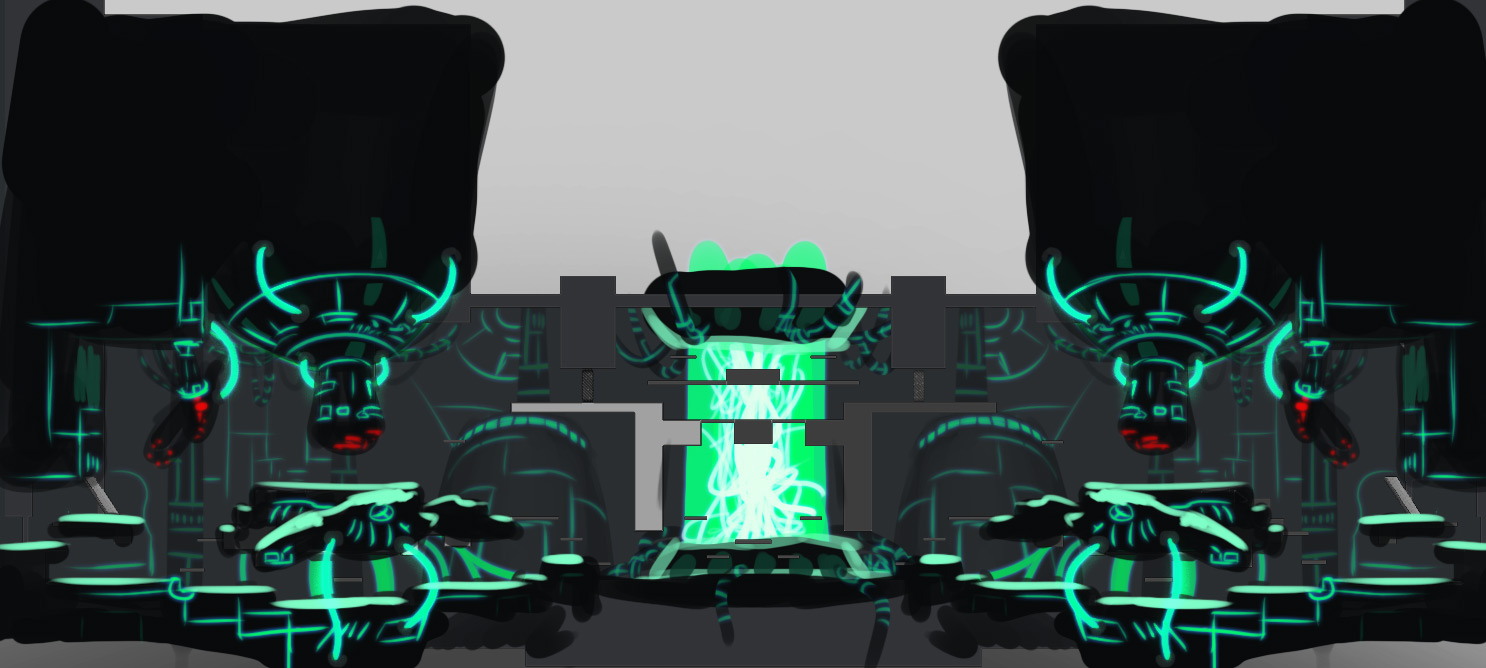
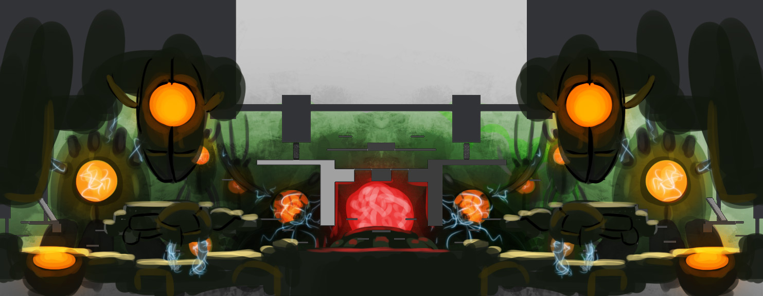
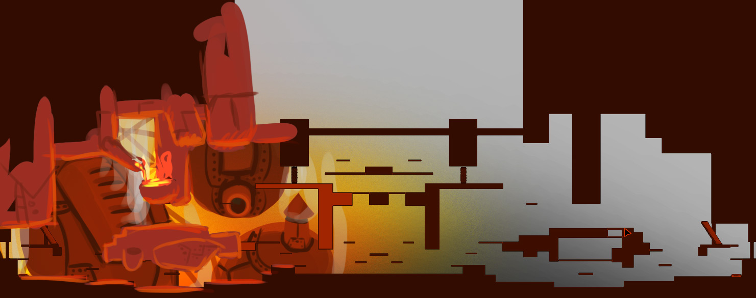
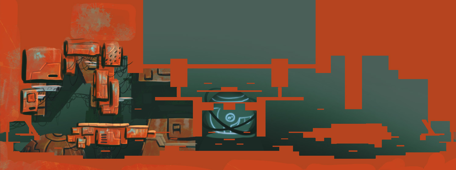
The concept art that the artists at Ronimo make is usually not intended for outsiders, and only for exploration and internal communication. That means that it is often rough, but at the same time communicates the core ideas really well. The result is series of pictures that explore ideas in all kinds of directions. Such series are often really awesome to see, especially for the great variation in colours and shapes they play with. Good artists can create magic with just a few rough lines. An excellent example is this set of designs that was made for the level AI Station 404 in Awesomenauts:

click for high resolution

These images were drawn halfway development of Awesomenauts by Tristan Kok, who did an internship at Ronimo at the time. Below are all of them individually and at full size. When you look closely, you can see that only as much has been drawn as is needed to communicate the idea and colour scheme of the map. The right half of the map is often even left out, and objects are drawn very roughly.

1. click for high resolution

2. click for high resolution

3. click for high resolution

4. click for high resolution

5. click for high resolution

6. click for high resolution

7. click for high resolution

8. click for high resolution

9. click for high resolution

10. click for high resolution

11. click for high resolution

I think the final choice our art team made was to combine the shapes from number 8 and the colour scheme from number 10. Some of the brownish ones also look pretty cool in my opinion (like numbers 3 and 5), but would not have added enough variation because their colour schemes are similar to the then already existing Sorona map.

Which of these designs do you like best?

Another thing you can notice here is that the level geometry is still visible in many cases. These images were drawn on top of a screenshot of the level as our game designers had made it at the time. At Ronimo most ideas start with a gameplay idea and the art is only made after we have played it and concluded that it makes for fun and interesting gameplay. A while ago I wrote a blogpost about how our artists usually jump in when the gameplay is already set: Extreme Transformation Of Nauts During Development.

The art is based on the gameplay, so what better way to draw it than on top of an actual screenshot of that gameplay? Beginning concept artists often forget this link between art and game: they draw objects from their most awesome angle, instead of from the angles under which the objects are actually seen in the game. When designing a car for a racing game, the most important thing is what it looks like from the back since that is how the player will be viewing it 99% of the time. Yet many beginning concept artists focus only on the front, since that is where a car looks most awesome.

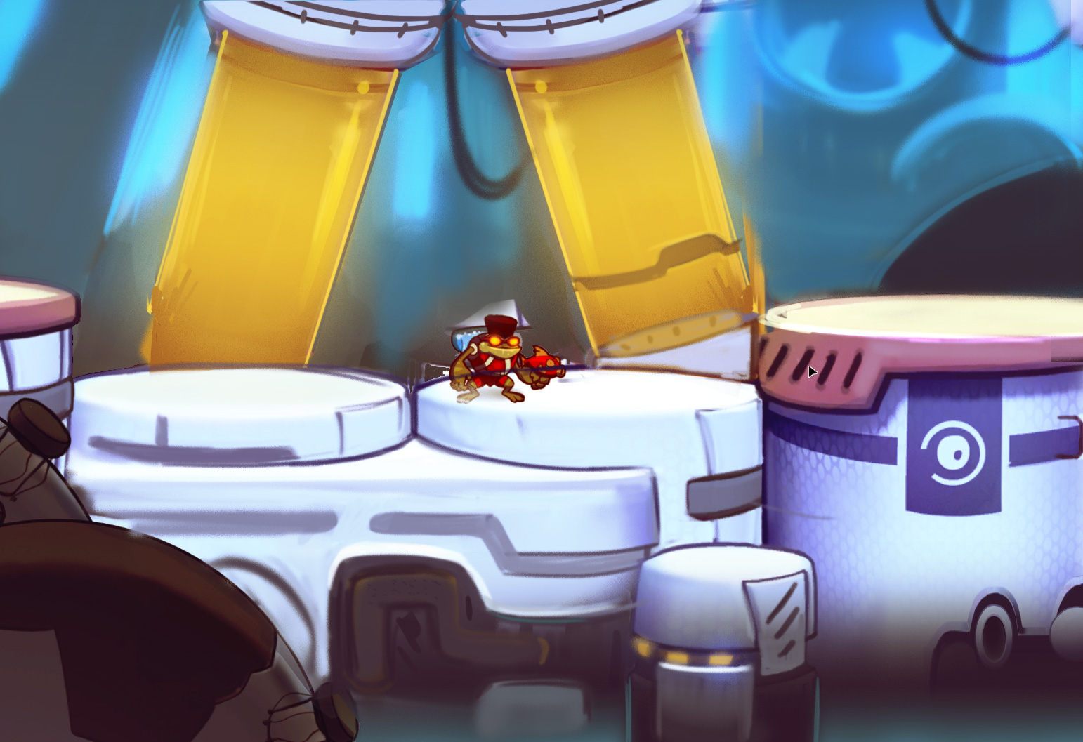
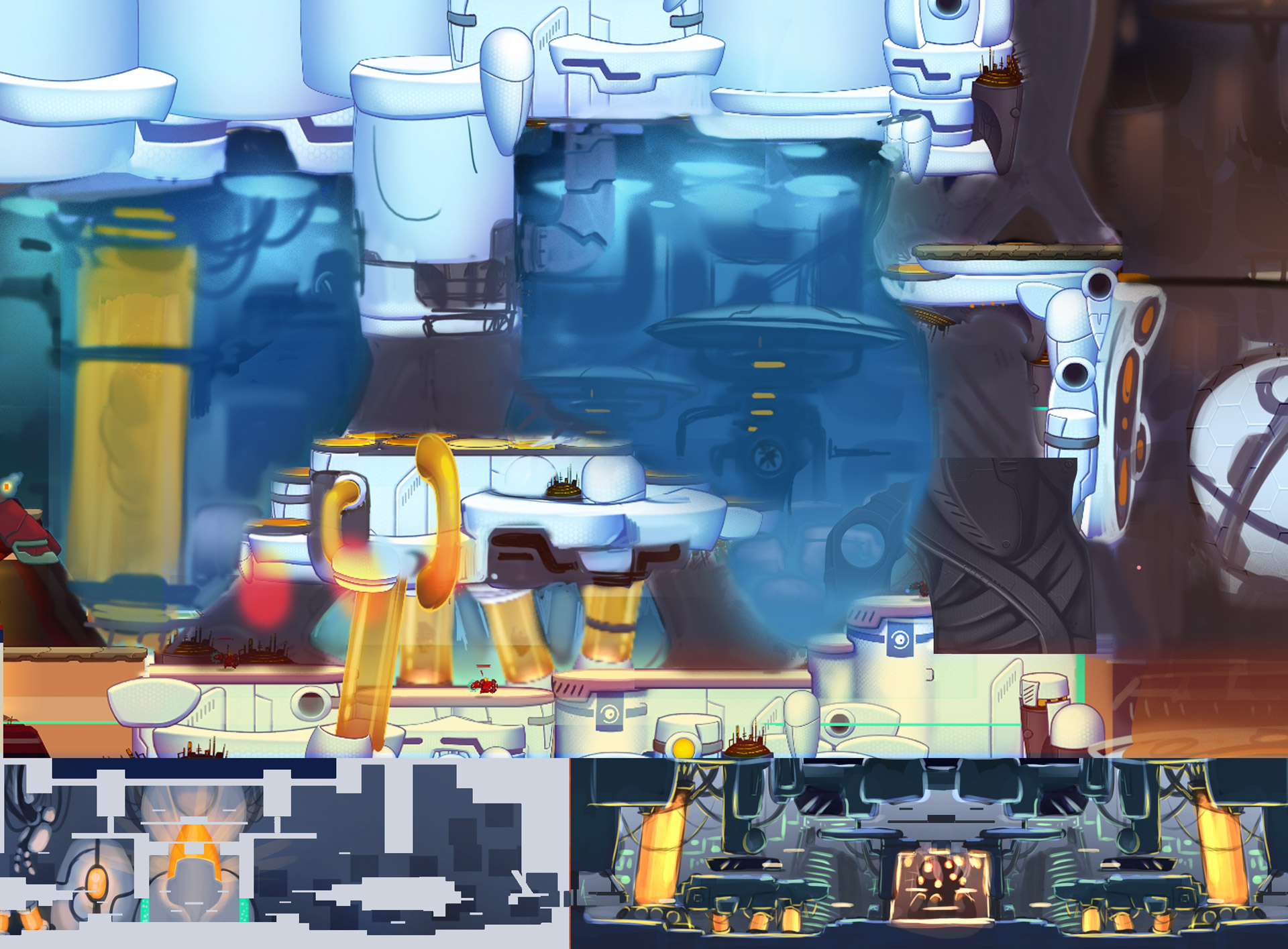
After some more concepting the level went into production. Art for it was gradually implemented into the playable level. Some shots didn't work immediately, so our lead artist Gijs grabbed a bunch of screenshots of the art that was there already and started drawing on top of them. Again: rough, drawing only as much as is needed to communicate the idea and style. A smaller studio like Ronimo does not have the limitless resources that AAA studios seem to have, so we need to work efficiently. Spending days on making awesome concept art while something simpler would suffice is not efficient.

click for high resolution

click for high resolution

click for high resolution

Gijs also drew a concept for the central machine in the level, as you can see below. In the bottom right this image even still shows the selection boxes of the objects that happened to be selected in our editor when the underlying screenshot was captured. I could personally never work like that, since I am way too much of a perfectionist. However, working so roughly is highly efficient and very fast, so this is much better than spending more time on perfecting an image while it already contains everything that is needed to communicate the point. (Another reason I could not work like this is that I am a programmer and am horrible at drawing...)

click for high resolution

I hope these images make it clear that concept art does not have to be super slick and detailed to work. The key thing is realise what the goal of the concept art is. If it is marketing or persuading people, then an image might have to be as awesome as possible. But if the goal is actual concepting, then it is much more important to explore many directions than to make slick images. As soon as the image communicates what it was intended for, there is no real need to add more detail.

Also, I personally think that despite the roughness, these images look incredibly cool, so I hope you enjoy viewing them as much as I do!