Showing posts with label level design. Show all posts

Sunday, 21 February 2021

Blightbound's approach to individual storytelling in a coop game

An interesting design challenge during development of Blightbound was how to combine personal storytelling with coop gameplay. In Blightbound three players play together, but they might be at different spots in the stories of their respective characters. How to make room for storytelling without spoiling stories for other players who might not be there yet, and without making players wait for each other? Today I’d like to dissect the approach we’ve used to solve this problem.

Before I continue, note that this blogpost will spoil some story moments. However, I’ve made sure to only take examples from early in each character’s story, so the videos in this post will only be a minor spoiler to the game.

Blightbound is a coop dungeon crawler, but unlike games like Diablo it doesn’t have a linear campaign. Instead, the player repeatedly plays a number of dungeons while learning each character’s story and gathering loot and more characters. In that sense it’s structured more like the end-game of Diablo, or like a looter shooter.


Blightbound is a 3 player game, with both online and local coop.

Another important aspect of Blightbound is that it has a lot of heroes. Instead of maxing out one hero for dozens of hours, the player gets to unlock a bunch and is invited to try them all. We would like players to vary what character they play. For this reason we wanted to tell a lot of small stories, interweaved with gameplay, instead of telling one big story. Each character has their own little story they go through.

Each hero in Blightbound has an individual story that’s told through the dungeon runs with that character. When 3 players play together, they each play a different character so they’re supposed to get different stories. This is where the issues that I’m discussing today arise. Players shouldn’t see the stories that the other players are getting, because they might not have progressed to that point with that character yet (spoilers!), or might have seen that bit already. Also, Blightbound is a fast-paced game so we don’t want players waiting for each other’s cutscenes.

The solution we came up with is that the storytelling is entirely private. When one player gets a bit of story for their character, other players don’t notice this at all. They might even simultaneously be getting different stories for different characters!

Now how do we make that work without letting players wait for an invisible cutscene? The simplest solution is used a lot in Blightbound: dialogue while gameplay continues. The player gets served portraits, speech bubbles and voice acting while the gameplay continues. So there’s no need to stand still and watch a cutscene.


Two examples of basic story beats during gameplay.

This does introduce a problem: getting extensive dialogue during combat is going to be very distracting and the player likely won’t be able to follow the text while focussing on the fight. Luckily, we needed some pacing anyway. A dungeon that’s 15 minutes of constant combat is both too intense and boring. So we should introduce some quieter moments anyway, and we make dialogue happen during such moments as much as possible. This way players can keep exploring but also have the mindspace to digest the storytelling.

If the player keeps moving, who is that dialogue with then? Here we’ve tried to vary it as much as possible. The simplest ‘dialogues’ are inner monologues of the hero. In other cases there’s a dialogue with an an NPC who’s standing in the level. Here too the other players can’t see this non-player character. To avoid waiting, the player can just keep walking: the dialogue starts when interacting with the NPC, but after that the player can run away and the dialogue will continue.


Gameplay continues during dialogues, so teammates don't have to wait for you.

To spice things up, we’ve added a fun trick here. The player is playing with two others who are random other heroes. To make the dialogues more dynamic, these other heroes will actually respond to it. But 21 characters all responding to all the story moments of all 21 other characters is way too many combinations. So instead we’ve defined a bunch of standard responses that each character has unique versions of. These are referred to in the dialogue scripts and then inserted dynamically during gameplay.

We have a total of 11 types of such standard responses and each character has their own line for each type. This way the responses can fit their personality. For example, these three lines show how different characters fill in the symphathy response:

  • "I feel your pain."
  • "You have the clan's sympathy."
  • "Would a moisturizing salve help?" (lol wut)


All eleven types of responses for one of the playable heroes.

What we have so far is cool, but still rather basic: all storytelling is done through dialogues and monologues and that’s it. From there we’ve looked into how we could spice things up without adding pauses. We should also not introduce too much work: Blightbound has more than 100 such story moments so efficiency is important.

The first element that adds some variation is how story beats are triggered. In some cases it’s simple: enter an area that’s marked and the storytelling starts. Some story events can trigger in any such area, while others need to take place in specific dungeons since they’re linked to that setting.

The more interesting ones require some form of interaction. For example, the mage Korrus looks for vases to investigate, so you need to spot them and interact with them. Other characters see someone standing in the dungeon and need to interact with the character, or see a hallucination. When there’s a hallucination hanging in the level, it’s only visible to the player who’s story beat this is for. To their teammates, it’s just a regular spot in a dungeon. Again we’ve made sure that we only use short and simple interactions, so that your teammates don’t need to wait for you.

One of the more fun types of story events are elite enemies. Some heroes need to fight specific characters to progress their story. To make this work, we’ve made special elite versions of some enemies that only trigger as part of someone’s story. The party of 3 players fight the elite enemy together. The nice thing here is that to your teammates, it’s just another elite enemy with some special skills (we have plenty of those outside story moments as well), while to you this specific enemy is a story moment and triggers dialogue. So this is a coop battle that is also a single player story moment. Quit neat, I think!


An example of a story beat in which we encounter an elite enemy.

Unlocking new heroes to play is a big part of Blightbound’s progression system. Here too a goal was to add some variation. Many heroes are simply found and rescued from a dungeon, but some others can only be unlocked by paying the merchant, by making your village prosper, or by finishing the story of another character.

For the simplest case, where a hero is rescued from a dungeon, we again ran into the problem of this being a coop game. My teammate might already have saved the hero that I’m rescuing, how does that work? To solve this problem, we’ve introduced the concept of survivors. These are basic characters that you can’t play. When you rescue a survivor, you get a little prosperity bonus to your village and that’s it. Now whenever one player is unlocking a hero by rescuing them in a dungeon, the other players see this as rescuing a generic survivor. This way it never looks like a teammate is reviving thin air: there’s always someone lying on the ground, ready to be saved. It might just happen to be a different character for each player.


Unlocking a hero compared to rescuing an anymous survivor.

One more nice trick that I would like to mention is one that we’ve so far unfortunately not finished implementing (Blightbound is still in Early Access on Steam). Since levels have these areas that are ideal for triggering story beats (no combat, some space for exploration), it would be nice to do something with that even when there’s no story beat for your specific character triggering in that run. So Roderick (the writer on Blightbound) has written a bunch of dialogues and banter that add some world building and personality building, but aren’t tied to any moment in the story. This way we can always trigger something. Since this is really a non-essential bonus feature we haven’t gotten around to actually implementing these lines yet, but I really like this feature so I can only hope that we’ll find the time to add this at some point.

Before concluding this blogpost I’d like to also have a short look at the implementation. With 21 heroes all having story moments and shouts and banter, Blightbound has a LOT of voice lines. There are more than 100 story events and over 6,000 voice files, ranging from short barks to several sentences. Working efficiently with such large volumes requires some proper tools, so Ronimo programmer Jeroen Stout (known for having made Dinner Date before joining Ronimo) implemented a system he calls Voice-A-Tron.

Voice-A-Tron was tailor-made for Blightbound and it’s a very neat tool that provides a bunch of features, including:

  • A spreadsheet that automatically presents all lines in two formats: per character and as it appears in dialogue (so alternating between lines of different characters).
  • Some simple scripting rules that allow defining dialogues, what portrait to use, where to trigger context-sensitive responses, triggering animations and even triggering related achievements and unlocks.
  • A system that automatically executes these scripts in-game, so that our game designers need to do less work to implement story beats.
  • Special objects that can be placed in levels to control where and when story beats are triggered.

Using Jeroen’s Voice-A-Tron system, Roderick Leeuwenhart wrote and defined all the story beats. Roderick is the writer for all Blightbound dialogues, as well as a series of short stories set in the Blightbound universe. The next step was that Ronimo game designer Thomas van der Klis did the actual implementation, for example defining where story events can trigger and creating special items and elite enemies.

The result of all this work is that in Blightbound, each character has their own story beats and these are told without interrupting the flow of gameplay and without spoiling teammates. At the same time the system is simple enough that it was doable to implement for all 21 heroes in Blightbound. While Blightbound isn't a storytelling game at its core, I feel this adds a lot of personality and purpose to the experience.

Saturday, 24 October 2020

Bending Blightbound's world to lower the horizon

In 3D games perspective is often treated as a given; a law of nature. But it doesn’t have to be that way: with some shader trickery or clever modelling, perspective can be manipulated to achieve certain compositions that may not be realistic, but look more interesting and are still convincing to the player. One such example is how we kept the horizon on screen in our new game Blightbound by subtly bending the world.

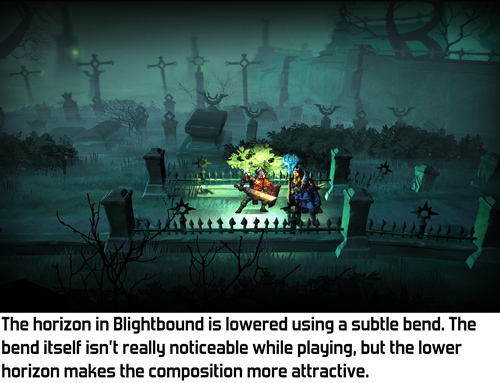
At Ronimo we come from a world of 2D games. In 2D, composition can be whatever you like. That’s why our art director Gijs Hermans may sometimes want to ignore standard perspective rules and instead looks at what he wants to achieve visually. Thus early in development Gijs came to me and said he wanted the camera to look down quite a bit, but still have the horizon in view. In fact, he wanted the horizon to be quite a bit below the top of the screen. His reasoning was that visuals look much better when you don’t see just the floor most of the time. Het position of the horizon is an important tool for shaping a composition.

The origin of this request is a clash that often happens in game development: pretty visuals versus gameplay clarity. Our artists spend a lot of time on achieving both goals simultaneously. A very successful example of this is the way gameplay objects and backgrounds are drawn in a different style in our previous game Swords & Soldiers 2, as I described in this blogpost.

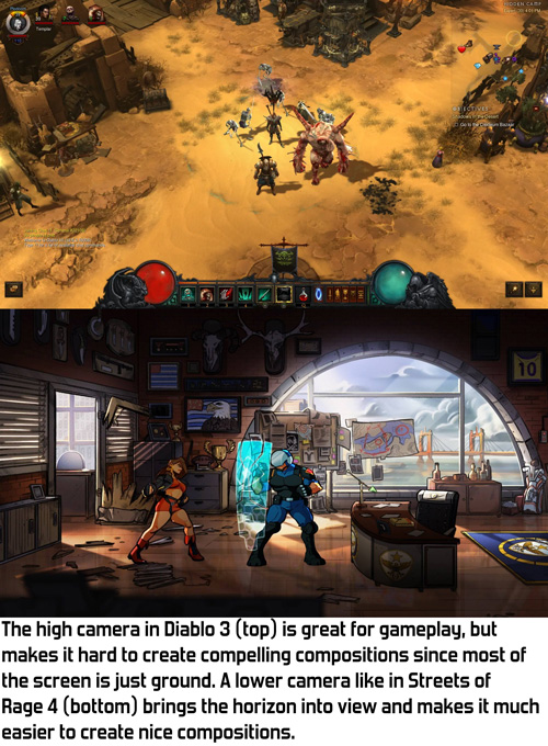
In a game where depth matters, like Blightbound, a low camera is problematic because it makes it difficult to see whether you are standing in front of an enemy or behind them. A high camera solves this, but a high camera removes the horizon from view, making the image a lot more boring.

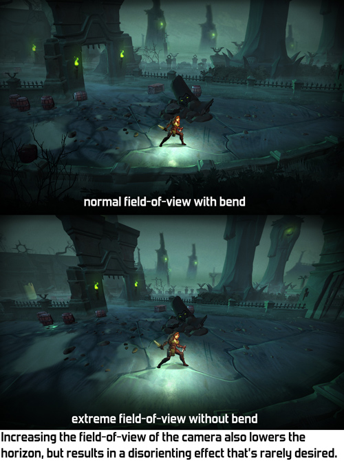
When Gijs came to me with this request, I thought of two possible solutions: either give the camera a wider field-of-view, or bend the world to move the horizon down. We tried the easiest solution first: wide field-of-view. However, it turned out this needed to be set so wide that the entire perspective looked skewed. Extreme field-of-view often isn’t very pretty and it definitely wasn't in Blightbound.

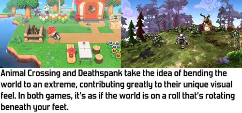
The alternative I came up with is bending the world down the further it is from the camera. This is an effect that’s used in a bunch of games to create a sense that the world is very small, making the world feel cutesy and funny. However, Blightbound is intended to be a dark fantasy game, definitely not something cute and funny, so we didn’t want anything that extreme. I figured that with some tweaking it might be possible to achieve a more subtle version of this that still keeps the horizon in view but doesn’t have the funny vibe.

My implementation of this effect is quite simple. In the vertex shader I bend down the world depending on the Z-position of the vertex in the world. The nice thing of implementing it this way is that our gameplay code and level design tools can assume a flat world, making them a lot simpler. The bending only exists during rendering, so gameplay logic doesn't need to take it into account.

A minor challenge in implementing this bend is how to handle lighting and shadows. When the camera moves forward and the world bends, we don’t want the lighting on objects to change, since that would make the bending very obvious and would make the player focus on the backgrounds instead of on the gameplay. Also, objects in the background shouldn't be more bright because they are rotated towards the light by the bend. My solution was to calculate all lighting, shadows and fog as if there is no world bend.

Also, a little technical note: since the bend happens on the vertices, objects need to have enough vertices. A big square plane for the ground with no vertices in between can’t be bent. Occasionally this caused bugs where a small object would float above a big object because the big object didn’t have enough vertices to be bent correctly.

The bend effect is quite fun to see in action when set to an extreme value. However, any kind of geometric deformation is quite noticeable when the camera moves, so we chose to fix the bend in the world instead of letting it move with the camera.


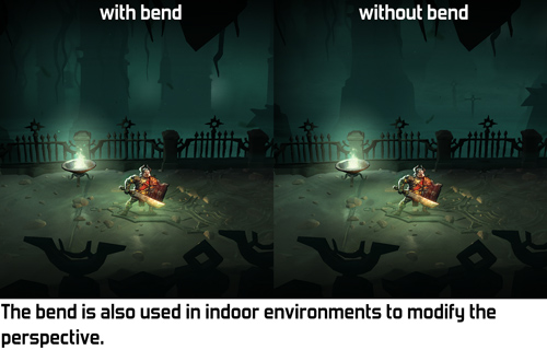
A few different settings for the bend, including the final one used in Blightbound.

As you can see in the video, the bend effect is kept quite subtle in Blightbound. We didn’t want that cutesy/funny effect at all, since this is intended to be a dark fantasy game. Our level artist Ralph Rademakers tweaked the effect and the camera a lot until he got it to a point where it felt like there was no bend at all, just a natural camera. However, if you compare with and without bend, you can see that the bend makes a huge difference in what you actually see. And that’s exactly how it was intended: achieve the desired composition but don’t make it look like anything weird is going on.

And then came the fog! The bend effect was implemented when we hadn’t figured out the lore of the world yet. We didn’t know then that we would want to have so much fog. In fact, the working title of the game used to be AwesomeKnights instead of Blightbound! Once we finally decided on the lore we knew that the world of Blightbound is covered in “blight”, a corrupting fog. To match that, Ralph added a lot of fog to all the levels. This creates a great atmosphere, but… hides the horizon!

Does that make the world bend useless? No, definitely not. It's still used in quite a few levels to change the perspective and have a more horizontal view on the background, even if we can’t see as far as before. It’s a more subtle tool than originally intended, but still a very useful tool.

I think the bend effect we used here is a wonderful example of the kind of graphics programming I enjoy most: looking at what’s needed from an artistic standpoint, and then making tech that achieves that. I’m personally not very interested in realistic rendering: 3D is just a tool to make cool art, whatever the shape or type. The bend technique used here makes no sense whatsoever from a physical standpoint, but it adds to making Blightbound a prettier, more compelling game.

Sunday, 15 January 2017

Adding more depth to 2D levels using scissor rectangles

While creating levels for Awesomenauts and Swords & Soldiers 2 our artists often struggled with how to create more depth. All those background elements from one area would slide into view in other parts of the level, limiting how deep the backgrounds could be. For the Starstorm level in Awesomenauts I've added a trick to our editors that solves this problem: scissor rectangles. It's a neat little trick that not only makes Starstorm have backgrounds with much more depth, but also makes rendering them a lot more efficient. So let's have a look: what's the problem exactly, and how do scissor rectangles solve it?

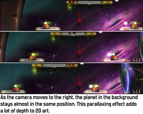
In a purely 2D game like Awesomenauts there's no real perspective: backgrounds are just a lot of 2D textures. As the camera moves all those layers move at different speeds to suggest depth. Traditionally in games that's called parallaxing. From a technical perspective that's basically all there is to 'perspective' and 'distance' in a game like Awesomenauts.

However, this simple idea of objects following the camera creates a big problem. An object that is really far away hardly moves on the screen when the camera moves. The mountain in front of you in the far distance? Walk 10 meters to the left and it's still in front of you. Walk 100 meters to the left and it's still in front of you. It's so far away that it's basically always in front of you. That's realistic and as intended, but what if two rooms in your level should have different objects in them? If the rooms are really deep (like for example a factory hall) then the objects in the back of one room will be visible in the other.


In a 3D game the solution to this is simple: just put a wall in between these two rooms. But this is not a 3D engine. This is a purely 2D engine and walls that go into the distance are not supported. Heck, we don't even have a z-buffer to figure out what parts would be in front of or behind that wall! Also, what if we don't want a wall? What if we want to suggest really deep spaces but don't want to put endless walls into the distance in between them?

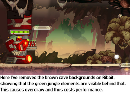
The solution our artists used in older Awesomenauts maps is that such deep rooms can't be close to each other. For example, in Ribbit IV the top part of the level is a lush jungle that continues far into the background. Originally my colleague Ralph also added deep caves in the bottom part of the map, but parts from the jungle became visible in the caves, and vice versa. So Ralph made the caves less deep. The jungle parts are still rendered behind the caves, but because the caves have a solid wall close to the camera the jungle isn't visible there anymore.


Not only is this very limiting for our artists, it's also a huge waste of performance: it causes a lot of overdraw. 'Overdraw' is when several objects are rendered on top of each other. The more objects are rendered on top of each other, the higher the overdraw is and the worse the framerate gets. Sometimes that's needed to get a certain effect, like when having lots of overlapping smoke particles. But here it's a waste: the jungle isn't even visible, so why render it? High overdraw is the number one performance drain in Awesomenauts, so not doing this would be quite wonderful. (For more on overdraw have a look at this post: Optimising Special Effects In Awesomenauts.)


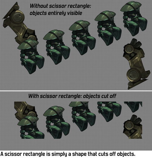
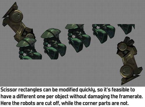
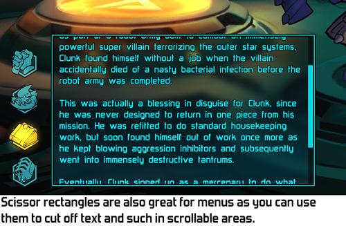
I had been thinking about this problem for a while, mostly coming up with solutions that were quite a lot of work to build, when one day I realised that videocards have a very simple feature that solves exactly this problem: scissor rectangles! The basic idea of a scissor rectangle is that when rendering an object, you tell the videocard to only render the parts of it that are within a certain area on the screen: the scissor rectangle. Everything else is cut off. It's like a mask in Photoshop, but in-game.


Scissor rectangles are a very simple and very limited feature. They only do rectangles that are aligned with the screen. So you can't have a rotated rectangle, or a shape that's more complex than a rectangle. If you want any of that you'll need to resort to more involved tech, like the stencil buffer, which isn't efficient to recreate differently for each object rendered. I was looking for something simpler, something that could be changed for each object rendered without causing a performance hit. Scissor rectangles provide exactly that.


The next question is how to integrate scissor rectangles with our tools: how can an artist easily define which objects are cut off by which scissor rectangle? I chose to link scissor rectangles to our animation system. An 'animation' in the RoniTech (our internal engine) is simply just a bunch of objects that might be animated, so a part of a level can also be an 'animation'. I made it so that each animation can have a custom scissor rectangle, placed by the artist. The resulting workflow is that a level artist creates a room or area in the animation editor, adds a scissor rectangle and then puts the entire 'animation' in the level. It's an easy and fast workflow.

Our levels are mostly decorated by my colleague Ralph, using art drawn by Gijs. On the Starstorm map Ralph used scissor rectangles extensively for the first time and I love the result: he put a lot of depth and detail in the backgrounds and the framerate is higher than on other maps because the scissor rectangles reduce overdraw. Here's a short demo video:


For any programmers that read this, here are some implementation details I've encountered. Feel free to skip this list if you're not a programmer. ;)
  • The videocard wants to know about scissor rectangles in screen coordinates, while the way we use them means our tools place them in world space. To use scissor rectangles this way you'll need to convert the coordinates yourself before sending them to the GPU.
  • If you accidentaly swap the top and bottom of the scissor rectangle then everything will still work fine on AMD and NVidia GPUs, but on some Intel GPUs the objects will disappear altogether.
  • It's not allowed to define scissor rectangles that are partially or entirely outside the screen, so be sure the cap them to the edges of the screen.
  • The relevant functions in OpenGL are glEnable(GL_SCISSOR_TEST) and glScissor()
  • DirectX 9: SetRenderState(D3DRS_SCISSORTESTENABLE, TRUE) and SetScissorRect()
  • There are equivalent functions that we use on Xbox One and Playstation 4. I haven't checked on mobile but I expect scissor rectangles are a standard feature on practically all videocards.


So there you have it: scissor rectangles! Not only did they enable our level artists to make deeper, richer levels, but they also improved performance by reducing overdraw and were quick and easy to add to our engine.

Saturday, 2 May 2015

Making gameplay stand out against rich backgrounds

Good game graphics are not just about being pretty. Equally important is that they communicate well. The richer and more detailed a visual style becomes, the more difficult it is to communicate gameplay clearly. With the amount of detail and variation we wanted in Swords & Soldiers II it was a challenge to make the units, spells and other gameplay objects pop out against the colourful backgrounds. Today I would like to show the tricks our artists used to make this work.

The reason this is important is that otherwise it would not be clear which objects are interactive and which are not. For example, is a tree a wall that I cannot pass through, or just a backdrop that has no effect on the gameplay? Ideally these kinds of things are immediately and intuitively clear to the player, without requiring any explanation.

Our new game Swords & Soldiers II launches on Wii U on May 21st.

The easiest way to achieve visual clarity is to not have any backgrounds or effects. Just a flat-coloured background with the gameplay objects. This looks horrible of course, so we want to add more art to the game. In general, the more you add to the world, the more difficult it becomes to distinguish gameplay objects from graphical fluff. In truly rich visual styles achieving clarity is a challenging balancing act. Objects should look like they belong in the world but at the same time pop out. The creators of a game can even choose to let go of visual clarity if they value visual beauty more.

At Ronimo gameplay always come first, especially when creating highly tactical games like Swords & Soldiers II and Awesomenauts. This means our artists had to employ a lot of clever tricks to combine the lush visual style with gameplay readability.

Our art director Gijs Hermans is responsible for maintaining a consistent style throughout the game. For this blogpost I interviewed Gijs about the tricks used in Swords & Soldiers II. Our level artist Ralph Rademakers showed me some additional tricks. Below I will be showing the clever techniques they used to make the gameplay stand out.


To make characters, spells and towers stand out against background objects they are drawn in a different style: with outlines and cell shading. The backgrounds are more painterly, lacking outlines and with more brushy and subtle lighting.


In many Disney classics, like Jungle Book (top), animated objects are in a different style than non-animated objects. Our artists love this combination so they even combined the animated and non-animated styles within the Viking base for its different parts. Note the difference in outlines and shading between the animated caterpillar and the ship itself.

(Click for high resolution)
The first version of the Viking base was more in the style of the backgrounds. To make it stand out more the final design was pulled more towards the gameplay style.


Early in development characters had hardly any shading (top), making their shapes less readable. Their final designs (bottom) have deeper shading and more saturated colours.

(Click for high resolution)
Our artists tried a lot of different shading and outline styles for gameplay objects. This image shows a series of early experiments with the goldmine. All the way to the right is the final design. Be sure to click this image for full resolution, since this scale does not show the differences well.


Background graphics are less saturated. Our level artist Ralph even used such atmospheric perspective on objects very close: the house here is directly behind the playground and thus too close for 'real' atmospheric perspective. Ralph desaturated it anyway to make gameplay stand out more.


Sheep are sometimes gameplay objects and sometimes background objects. To make this clearer they are blended a bit towards a single colour when they are in the background or foreground.


Background brightness is often changed to make gameplay stand out more. In both of these images the background is brighter near the gameplay layer, adding contrast. Higher up in the screen no gameplay happens, so there 'normal' colours are used in the background.


Gradients are not the only way to make the playground stand out: here the bushes directly behind the playground don't have snow, turning them into a green border between the snowy playground and the snowy trees. It would be weird if only these objects lacked snow, so snow is also removed from other objects like the rooftop in the background on the left.


Corpses have gameplay functionality but having lots of them really clutters the view. We therefore desaturate corpses to make soldiers walking in front of them stand out more.


Depth of field blur on the background not only adds depth but also makes the foreground pop. We use this trick in both Swords & Soldiers II and Awesomenauts to make gameplay more readable.

Sunday, 19 April 2015

The level art tools for Swords & Soldiers II

For our new game Swords & Soldiers II (coming to Wii U on May 21st!) we wanted to create detailed and varied levels. Because of the number of maps and their large size we needed art tools that provide a lot of automation to be able to populate them quickly. At the same time we wanted to allow customisation and control over the details to create unique, designed places. Today I would like to show the tools that Ronimo programmer Machiel van Hooren developed for our artists. Check especially the awesome demo video at the end!

Our starting point was the level editing tools we made for Awesomenauts. Those are very flexible and not tied to a single game, so we could pretty much use all of them directly in Swords & Soldiers II. However, the shape of the levels in Swords & Soldiers II is very different: the Awesomenauts tools are built around rectangular boxes, not curving landscapes. Nevertheless they provided a really strong beginning. I made a short video montage about the Awesomenauts tools for a blogpost a couple of years ago, here it is again for those who hadn't seen it before:


The first thing we needed to add for Swords & soldiers II was curving terrain. The core gameplay takes place on a single line with little slopes and hills. So we made a new feature with which our artists place TerrainNodes in the level, and then the engine automatically generates a smooth terrain that goes through those TerrainNodes.

To calculate a smooth line through those points we use standard bezier splines. We also tried using slightly simpler Hermite splines, but we didn't like the look of those. Bezier splines usually come with additional control points for more control over the curvature. To simplify things we calculate the control points automatically based on the previous and next TerrainNode. This gives slightly less control, but that turned out to be fine for our artists and it makes the tools simpler and faster to use.


The next step is terrain layers. We wanted to add as much depth to our 2D art as possible. Having more terrain layers in the foreground and background is a good way to accomplish this.

The most obvious method is to just allow our artists to create more terrain layers by hand at different parallax depths. However, efficiency was also a goal, so we wanted to avoid creating all those layers by hand. Therefore we made it so that the parallax layers are copies of the main terrain. To be able to create some diversity we added settings for things like random noise, different textures and colour modifications. Not only is it faster to create levels with these copied terrain layers, it also means that if the main terrain is edited (and it often is), then the background and foreground layers automatically change with it. This makes iteration and modification much quicker.


The big limitation this creates is that the hills in the background are the same as those on the playground. Sometimes our artists wanted to break free from this pattern. We could have tried making the terrain tools more flexible to accommodate for this, but often the big background objects aren't hills, but an inn, or a wall, or something else. The solution was simple: the artists just placed a big texture of a hill in the background and that's it.


Plants, small vegetation and other props are all tied to the landscape. To help place those quickly we created ObjectDroppers. An ObjectDropper attaches one or more objects to a terrain layer, allowing an artist to drop a bunch of bushes or flowers on the landscape quickly. Props are dropped using a random seed and the artist can try different seeds to look for one that he likes. With a bunch of prop types a level can have its basic setting in place really quickly, after which the artist can focus on adding the unique flavours. Since the dropped props are tied to the landscape, modifying the terrain also automatically modifies the props, making tweaking the terrain that much faster.


Our level artist Ralph Rademakers even used ObjectDroppers to place bigger objects like trees. By working efficiently with these tools Ralph was able to dress up the simpler levels in just a few days per level, using the textures drawn bij Adam Daroszewski and Gijs Hermans.

The other main tools used for the level art are things we inherited from Awesomenauts: placing textures and animations in levels and recolouring them. You can find some good examples of the power of in-engine recolouring in this blogpost: Using 2D daylight assets to create a night level.

Now that I have discussed the tools, let's have a look at them in action in this little video:


I think the main lesson that can be learned from the Swords & Soldiers II level art tools, is that it's sometimes a good idea to limit control to make the workflow faster. The ObjectDroppers create a lot of objects at once, giving much less control than placing them by hand, but also being much, much faster. Similarly, the background and foreground terrain layers being copies of the main layer is limiting, but also very efficient. Where required our artists had enough other tools to break through the limitations by hand, resulting in a good balance between automation and old fashioned handwork.

Sunday, 8 March 2015

The downsides of gameplay variety

An important goal in the game design of Swords & Soldiers, Awesomenauts and Swords & Soldiers II is gameplay variety. We try to make all the classes, units and factions play and feel as differently is possible. This makes it more fun to try them all and allows for much more interesting and varied tactics than if everything feels the same. It seems quite obvious that a game gets better if more diversity is added, as long as you have the budget to do so and it does not take away from the core vision. However, there are some serious downsides that are not as obvious. Adding more diversity can hurt many different aspects of a game, as I will explain in this blogpost.

When striving for variety it is important to be aware of the trade-offs. It does not mean that you should avoid diverse mechanics, far from it: it is a key element of the games we make at Ronimo! But consider the consequences before blindly adding variety.

A great example of such trade-offs can be found in the movement mechanics of Awesomenauts. We try to make every character feel different, not only their combat skills, but also their basic movement. Some characters can jump, others can fly, float, make little hops in the air or double jump. There is also variation in walking speed, acceleration and sliding time. Not all of the 21 characters we have so far are completely unique in their movement, but there certainly is a lot of variety. As the interplay between the different classes in Awesomenauts is a key part of the game, this diversity is really important to us.


So where is the trade-off? The problem is that there is such a thing as the ultimate jump. If a jump has the right duration, height and speed, it just feels excellent. Make it a little bit faster or slower and it is instantly less glorious. The jumps in the old Mario games are a great example of this. They strike a perfect balance and it feels awesome just to hop around.

This is where variety bumps its beautiful head. If every jump is to feel different, they cannot all hit that sweet spot. They can feel good in their own way, but it is practically impossible to make them all feel equally super. My colleague Fabian Akker, currently lead game designer on Awesomenauts, recently voiced this very clearly during an internal meeting: "Yes I can make this character faster and yes he will play better then, but I can't make them all be Mario because they will all feel the same." Adding variety will often make the individual parts feel slightly less good than possible, because there is only one "best thing in the game" and not everything can be that thing.

Another example where movement diversity can hurt a game is in graphics. In early prototypes of Awesomenauts we had a skill to walk on ceilings and another to walk on walls. For various reasons both were removed, and one of those reasons was how limiting this would have been to the graphics. To communicate clearly where the player can walk, floors need to be mostly straight and clear. If characters can also walk on ceilings and walls, they would have to be straight and clear too. That would have been a huge limitation to our art style! In this case adding diversity to the gameplay would have removed diversity from the graphics because of the restrictions imposed by the necessities of walkable surfaces.


Diversity is also a problem for balance. The easiest way to make a game perfectly balanced is to have but a single character. Boring, but definitely 'balanced'. As soon as you add more characters, balance quickly becomes infinitely complex and often practically impossible to achieve perfectly. In a previous blogpost I discussed how there are many sides to balance. Even if you manage making all the characters equally strong for pro players, they might still be imbalanced for beginners, in specific team compositions, or in some other way.

A great example of this can be found in map design. It is fun to have a bunch of maps that all play differently. But even the smallest difference can cause problems. If one map is larger than the rest, slow characters will be at a disadvantage. You might try to solve this by giving slow heroes buffs suited to large maps, but that probably introduces other problems. The simple truth: the more diversity, the more impossible it becomes to achieve perfect balance.

And yet balance is so important! How to handle this then? In Awesomenauts we had the problem that one map (AI Station 404) had a single lane at the centre, bunching up everyone. This gave characters with strong area-of-effect attacks (like Raelynn) too much of a benefit. We ended up modifying this map (into AI Station 205) and removing the old version from ranked matchmaking. The downside to this solution is that we lose some diversity in map layouts.


This is just one solution. Another would have been to show the players which map they were getting, so they could avoid certain characters when they feel they are underpowered on a specific map. This would allow us to keep the maps diverse, but at the cost of character diversity, since each map would probably see a more limited set of characters being used. In an ideal world one would find balance tweaks that influence only specific characters on specific maps. However, balance is so complex that such solutions do not always exist, or cannot be found.

Variety can also make a game too complex. I recently finished Advanced Warfare, my very first Call of Duty experience. At the beginning I was immediately overwhelmed by the number of guns, grenades, dashes and options. This is likely due to the series' yearly updates, which force them to add something every time to make it fresh again. At the end of the campaign I still couldn't remember the buttons for half the things I could do. This increase in possibilities adds burdensome complexity, requiring more explanations and tutorials.


We also see this in Awesomenauts: with every character we add it becomes more difficult for beginners to get into the game. In every match they encounter another new Naut they don't know how to fight yet. Having more characters adds longevity and depth, but might make the experience during the first few hours worse for some players.

As a final example I would like to discuss my own hobby project Cello Fortress. Cello Fortress is a hybrid between game and live performance, which means that players only play it for ten minutes each during an event (have a look at this trailer to see how it works). In such a short playsession I can hardly explain anything, so the game needs to be extremely simple. Sometimes players come to me afterwards and ask why I didn't add more diverse weapon. The answer is really simple: because there already is so much I need to explain and communicate during those ten minutes. Variety often adds complexity and there is a limit to how much a player can stomach in such a short session.


I love gameplay variety. My favourite game of 2014 is Far Cry 4, exactly because there is such a big open world where I can do all of these different things. Variety is also super important in our own games Awesomenauts and Swords & Soldiers. But it is important to keep in mind that adding diversity almost always comes with a cost somewhere, so you shouldn't be reckless with it. Add variety, but do it deliberately and take into account the trade-offs it always brings.

Special thanks to Roderick, founder of Leeuwenhart Publishing, for helping me improve my English writing skills. Roderick is the writer of the young adult book Pindakaas & Sushi (in Dutch) and did some freelance writing for Awesomenauts.

Saturday, 8 November 2014

Using 2D daylight assets to create a night level

Changing the lighting in hand-drawn art is a challenge. While in 3D games you can simply modify the light, there is no such thing when using 2D assets. In our new game Swords & Soldiers II all the level assets have their lighting drawn in. Of course you can ask the artist the redraw the image with different lighting, but that costs a lot of additional time and texture memory. We managed to re-use our daylight textures to create convincing nighttime levels, so today I would like to explain the tricks used to achieve that goal.

Today's post is all about the artistry of Ronimo artist Ralph Rademakers. He uses images drawn by Adam Daroszewski* and Gijs Hermans to decorate the levels in Swords & Soldiers II. Ralph keeps surprising me with the unexpected tricks he manages to pull off with our internal tools.

*By the way, note that Adam works as a freelancer these days. He drew most of the level props in this post and you can see some more of his amazing work here.

There is basically a whole series of tricks that Ralph uses to turn day into night. I'll let the images do most of the talking today:


Even in the night a form of atmospheric perspective can be used: in the video below the smoke in the foreground is much brighter than the smoke in the background to suggest additional depth. When I built the recolouring shaders and tools I never expected them to be used on almost every object in the levels. Also, note how the stars have been made using particles to make them blink and appear in random places for a more lively look.


As a starting point Ralph usually chooses one colour multiplier for all objects in the level. He tweaks the colour per object to make it look exactly right. In the end few objects use the same colour multiplier, but they all started from the same point.


It surprises me how often these gradients are reused. From fog to lights to lens-flares and even just for hiding objects that should not be visible from certain viewpoints. The big downside of this approach is that it results in a lot of overdraw, which is also the main performance bottleneck in Awesomenauts. Good thing modern videocards are so insanely fast...


The lights in the bar below blink to make the scene more dynamic. However, blinking lights attract the eye too much while the focus should be on the gameplay. Therefore the blinking is not between on and off, but between the more subtle slightly-bright and extra-bright. Also note how the blinking lights illuminate the barmaid's arm.


This bar is also a great example of Ralph adding tons of little animating details, like the drunk guy on the roof. Many of those details will likely not be seen by most players, but the total effect of having such a detailed world is very strong, even for players who don't look at it specifically.


As a programmer when thinking about lighting in 2D games I immediately start considering technical solutions. I would look at things like normal maps (very possible in 2D) or automatic rim lighting. However, more creative, art-driven solutions often work much better, especially when creating a visual style with such a painterly look as in Swords & Soldiers II. The simple yet clever techniques Ralph used to create this nighttime level are a great example of this.

Sunday, 20 July 2014

Evolving level art from Swords & Soldiers 1 to 2

In Swords & Soldiers 2 we are stepping up the quality of everything compared to the original. Level art is one of the areas where we are improving the game a lot. With our improved tools we can make them look a lot more detailed and varied. We also approach level art in a very different way now. Today I would like to discuss how the approaches in both games differ and why we switched to different techniques.


In the original Swords & Soldiers the levels were mostly procedurally generated. The only parts that were placed by hand were the ground itself and the small props on it, like grass and flowers. The foreground and background layers were randomly filled with objects. Since this is essentially a 1D game I simply wrote an algorithm that placed mountains (or trees, or houses) at varying distances from each other. Each layer had a bunch of different textures and settings for how densely it should be filled with objects.


There are many arguments in favour of procedurally placing objects like that, but at the time only one really mattered: we didn't have any tools to place objects by hand. I was the only full-time programmer on Swords & Soldiers 1 and I had to build all the gameplay plus the entire engine, so there was no time to create such tools. I did have a couple of interns helping with programming, but in total there was just way too little time to implement any real tools for level creation.

Levels therefore had to be created in Notepad, as I previously described in this blogpost. This worked surprisingly fast and simple for our artists and designers, but of course precise control over graphics is not possible this way.


Our artists had a limited palette of options to differentiate levels and create varied places. They made six different art sets they could use for parts of levels: desert, snow, grass, rocks, jungle and cherry blossom. They could set a gradient for the sky colour and a second gradient to modify the colour of background props. They could set the weather to rain or snow, modify the density of background props, foreground props and clouds and place smaller props on the landscape by hand.

While all of these options together may sound like a decent set of tools to create unique levels, in practice this is not the case. Levels in Swords & Soldiers 1 quickly blend together and start to look similar. One reason for this is that levels often contain more than one environment type. They might for example vary between rocks and desert. An environment type always randomly varies between all the textures it has. The result is that in only a few levels we can have seen nearly all level art in the game. In fact, the very long Berserker Run level contains all six settings and thus contains nearly all level art the game has.


Another problem is that randomly placed objects may stand in a different spot in every level, but they all feel the same. No matter at what distance the same set of mountains is positioned, it always feels like the same place. This could of course be done better with a more advanced procedural algorithm and a smarter set of textures, but in practice procedural content nearly always suffers from this.

This problem even shows in a game like Diablo III, which has high quality procedural world generation at its core. Blizzard spent enormous amounts of time on creating sophisticated algorithms and tons of art assets for random world generation, and yet when I played through Diablo III it felt like I was constantly visiting the same places. Either a place is uninteresting, with some random trees and bushes, or it is unique with some special big props. The number of unique props in Diablo III is large but not infinite, so they start to feel repetitive quickly.

I have not seen a single game with procedural worlds where the visuals did not become repetitive really quickly. In that sense I am slightly afraid for No Man's Sky: the game looks mindblowingly amazing, but I can hardly imagine they solved this problem well enough to keep planet discovery visually interesting. (I sure hope they did though, because that game looks soooooo good!)

In Swords & Soldiers 2 we therefore concluded that we did not want to use this approach anymore. We also don't need to work around a lack of tools anymore, since we now have the impressive toolset we created for Awesomenauts. All of that is at our disposal for Swords & Soldiers 2 as well.

By placing most objects by hand our artists can now create real compositions. The way trees are arranged can create forests, small clearings and green fields. This way even without additional assets it is possible to create places that feel much more real and unique than any procedural algorithm can. Of course one could add procedural rules to create such places, but there are limits to how much can be done this way, especially because every rule that creates a specific kind of place can be used only a couple of items if repetitiveness is to be avoided. With a good artist there really are no limits to how much variation and uniqueness can be created. Most of the levels in Swords & Soldiers 2 are filled with art by Ronimo artist Ralph and he is a true master at creating interesting compositions and little micro-stories through object placement.


Another big difference between Swords & Soldiers 1 and 2 is that in 2 we have much bigger props. In the original game mountains and trees were relatively small, so you always saw a lot of them. In the sequel we have scaled them much larger, so you might see only one or two really large mountains in the background, instead of dozens. This makes it all feel a lot larger, drawing the player more into the world instead of looking at funny miniatures. At the same time this makes the backgrounds look less repetitive: if you don't see ten mountains at the same time, then it is also much less obvious that several of them use the same texture.

This is strengthened by another big improvement in Swords & Soldiers 2: there are many more unique assets for specific levels. For example, one level plays in a Viking golf court and there are golf related objects everywhere. These props are not used in any of the other levels, making this level unique and memorable. This way the player will remember more specific things than in Swords & Soldiers 1, where all the levels looked quite similar. A level doesn't even need all that many unique props: since background objects are so much larger now, having one really big prop can sometimes already define a level.


Another improvement that I would like to mention today is the art style. The original game had a very simple cartoony look, while the sequel is much more detailed and painterly. Our artists went for a style reminiscent of French animation and it works beautifully. Most of the level art in Swords & Soldiers 2 is drawn by Adam Daroszewski. He worked as a freelancer for us and did an amazing job at creating a painterly and coherent look.

I have spent most of this blogpost explaining how Swords & Soldiers 2's level art is better than the original. There is however also one big downside: it is much more work to make. With the lack of proper tools and the simple style we had when we made Swords & Soldiers 1 it took very little time to decorate more levels. In part 2 everything requires much more work to do. It really shows, but it is an important trade-off to be aware of. Not having proper tools means that there are a lot of things that artists simply cannot do and this saves huge amounts of time.

Limitations like that are a very effective way of limiting the amount of time it takes to make a game. The better your tools, the bigger the risk of using them too much. We have already spent much more time making Swords & Soldiers 2 than originally planned and the game isn't even done yet. At the same time it is looking so good that spending so much time is totally worth it. I hope that when the game launches you will be as enthusiastic about it as we are! ^_^

In conclusion, I would like to say that I think procedural level generation is great for games that evolve around it, but for a designed experience having hand-made levels works much better. Levels in a game like Swords & Soldiers 2 look better when made by hand than when generated.

Saturday, 25 January 2014

Concept art can be raw: early designs for AI Station

When people think of concept art, they usually think of the super slick artworks that AAA games release as part of their marketing. However, making such perfected art takes a lot of time and is very inefficient when the goal is to explore many concepts. Today I would like to show the concept art that our artists made for the map AI Station 404 in Awesomenauts, as it is an excellent example of how rough real concept art can be.

click for high resolution

A couple of months ago I was at a presentation at the Control Conference where concept artist James Daly showed their concept art for one of the Transformers games. Every image looked mindblowingly awesome (have for some examples a look at this, this and this), but in a sense this is also weird: it seemed like concept artists only make superbly detailed and shaded paintings.

Presentations like that give the impression that that is how concept art works, but in practice making such high quality art is highly inefficient. The goal of concept art is not to make pretty pictures, but to design things for the game, to explore. If every image needs to be so detailed, then there is much less room for exploration than if an artist instead creates many simpler, quicker sketches and tries out many things that way. I suppose Daly and his team also made tons of quicker sketches and designs, but I don't remember seeing any of those in his presentation.

Of course such slick concept art does serve several purposes: it can be used in marketing and to make people enthusiastic. I imagine that any art that needs to be approved by a gigantic IP holder like Hasbro (for Transformers) has to be extra slick just to convince Hasbro to approve the designs. However, in practice most concept art is not intended for marketing and can thus be much simpler. Another reason why concept art might be so detailed is to help 3D artists, especially if the artist lacks imagination or is outsourced off-site.

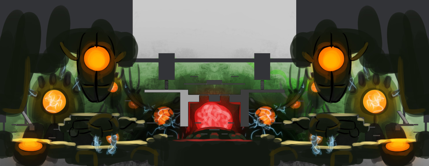
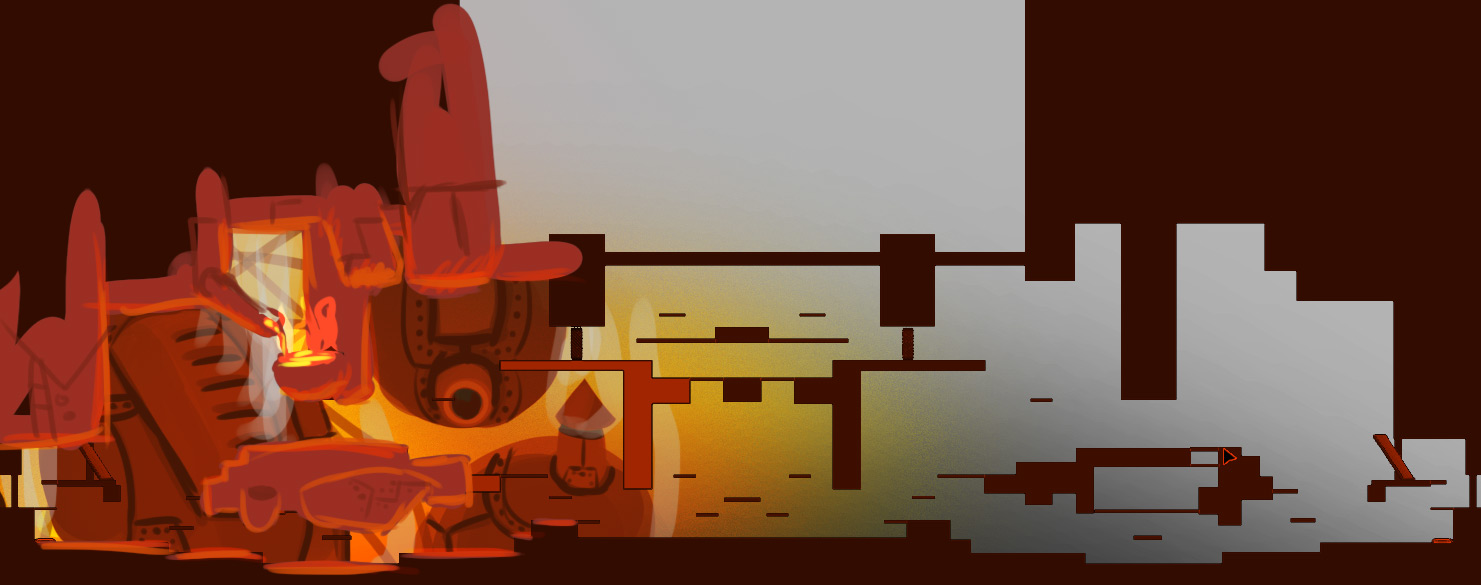
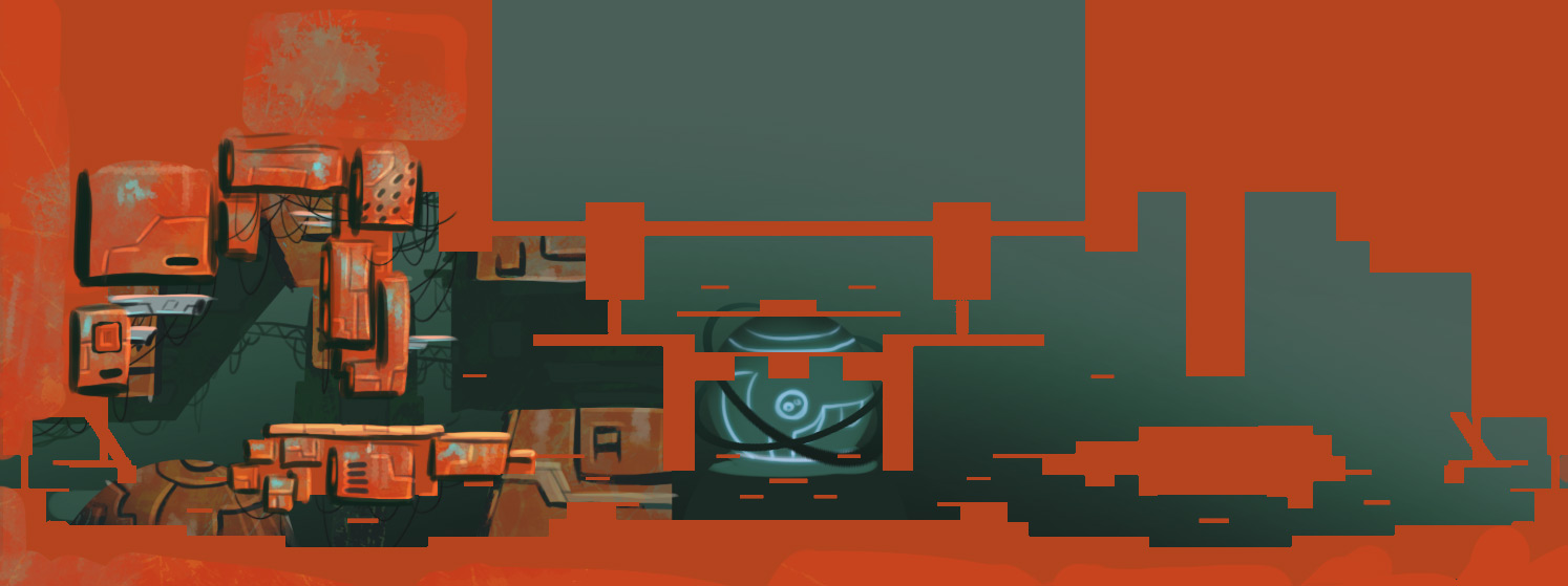
The concept art that the artists at Ronimo make is usually not intended for outsiders, and only for exploration and internal communication. That means that it is often rough, but at the same time communicates the core ideas really well. The result is series of pictures that explore ideas in all kinds of directions. Such series are often really awesome to see, especially for the great variation in colours and shapes they play with. Good artists can create magic with just a few rough lines. An excellent example is this set of designs that was made for the level AI Station 404 in Awesomenauts:

click for high resolution

These images were drawn halfway development of Awesomenauts by Tristan Kok, who did an internship at Ronimo at the time. Below are all of them individually and at full size. When you look closely, you can see that only as much has been drawn as is needed to communicate the idea and colour scheme of the map. The right half of the map is often even left out, and objects are drawn very roughly.

1. click for high resolution

2. click for high resolution

3. click for high resolution

4. click for high resolution

5. click for high resolution

6. click for high resolution

7. click for high resolution

8. click for high resolution

9. click for high resolution

10. click for high resolution

11. click for high resolution

I think the final choice our art team made was to combine the shapes from number 8 and the colour scheme from number 10. Some of the brownish ones also look pretty cool in my opinion (like numbers 3 and 5), but would not have added enough variation because their colour schemes are similar to the then already existing Sorona map.

Which of these designs do you like best?

Another thing you can notice here is that the level geometry is still visible in many cases. These images were drawn on top of a screenshot of the level as our game designers had made it at the time. At Ronimo most ideas start with a gameplay idea and the art is only made after we have played it and concluded that it makes for fun and interesting gameplay. A while ago I wrote a blogpost about how our artists usually jump in when the gameplay is already set: Extreme Transformation Of Nauts During Development.

The art is based on the gameplay, so what better way to draw it than on top of an actual screenshot of that gameplay? Beginning concept artists often forget this link between art and game: they draw objects from their most awesome angle, instead of from the angles under which the objects are actually seen in the game. When designing a car for a racing game, the most important thing is what it looks like from the back since that is how the player will be viewing it 99% of the time. Yet many beginning concept artists focus only on the front, since that is where a car looks most awesome.

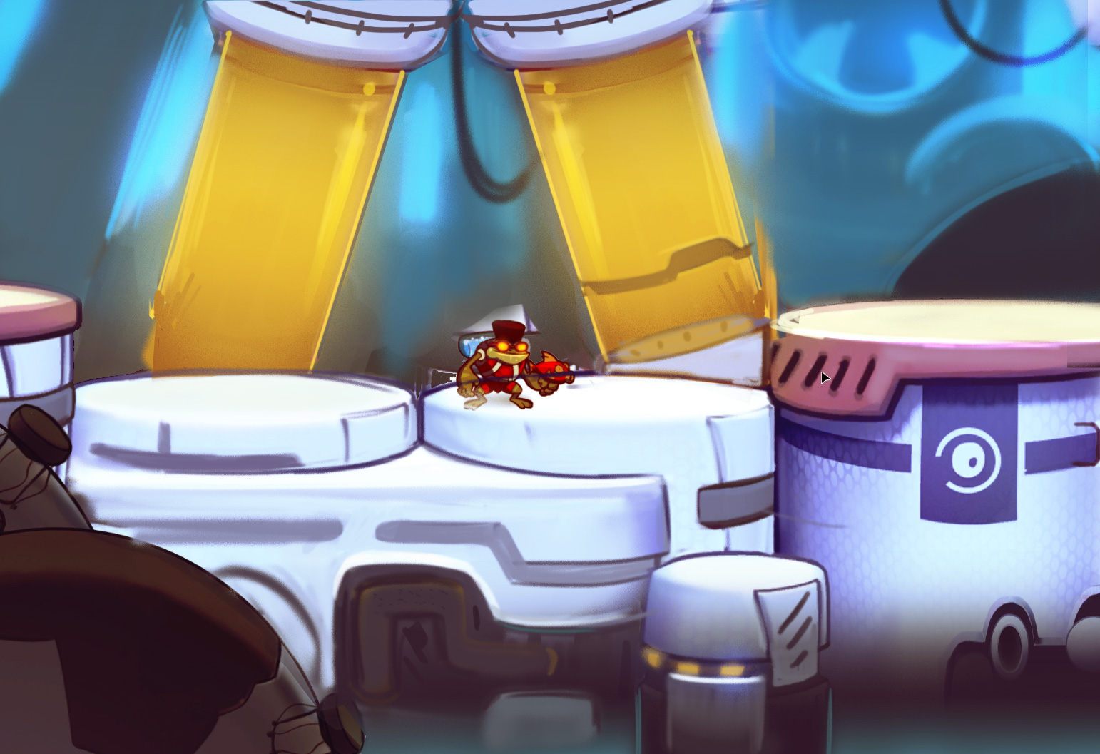
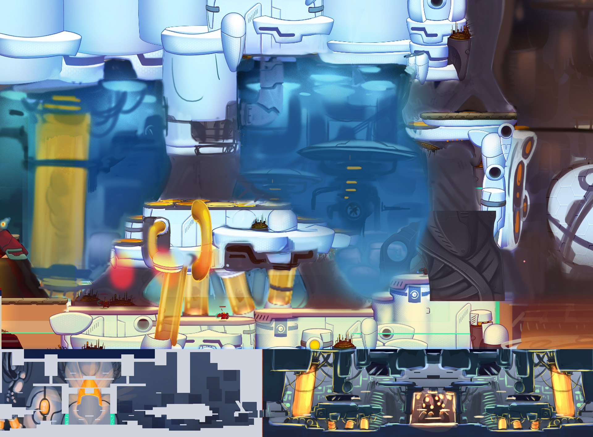
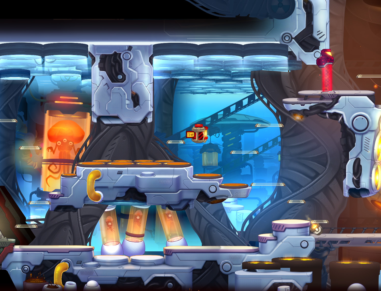
After some more concepting the level went into production. Art for it was gradually implemented into the playable level. Some shots didn't work immediately, so our lead artist Gijs grabbed a bunch of screenshots of the art that was there already and started drawing on top of them. Again: rough, drawing only as much as is needed to communicate the idea and style. A smaller studio like Ronimo does not have the limitless resources that AAA studios seem to have, so we need to work efficiently. Spending days on making awesome concept art while something simpler would suffice is not efficient.

click for high resolution

click for high resolution

click for high resolution
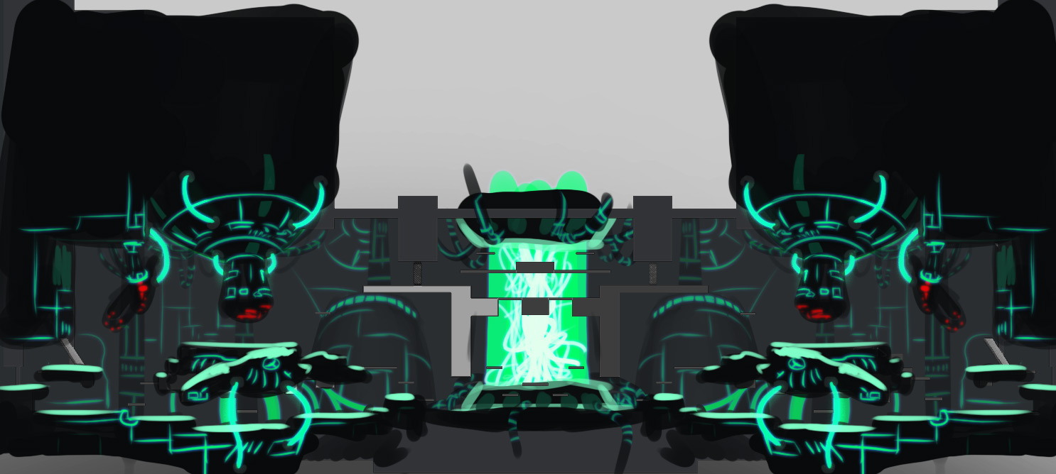
Gijs also drew a concept for the central machine in the level, as you can see below. In the bottom right this image even still shows the selection boxes of the objects that happened to be selected in our editor when the underlying screenshot was captured. I could personally never work like that, since I am way too much of a perfectionist. However, working so roughly is highly efficient and very fast, so this is much better than spending more time on perfecting an image while it already contains everything that is needed to communicate the point. (Another reason I could not work like this is that I am a programmer and am horrible at drawing...)

click for high resolution

I hope these images make it clear that concept art does not have to be super slick and detailed to work. The key thing is realise what the goal of the concept art is. If it is marketing or persuading people, then an image might have to be as awesome as possible. But if the goal is actual concepting, then it is much more important to explore many directions than to make slick images. As soon as the image communicates what it was intended for, there is no real need to add more detail.

Also, I personally think that despite the roughness, these images look incredibly cool, so I hope you enjoy viewing them as much as I do!